Tag Archive: “mac”
Calibre ebook cover art in Slideshow screen savers
The Mac OS X 10.8.3 update is out. Among the various minor fixes is this item:
Allows the Slideshow screen saver to display photos located in a subfolder
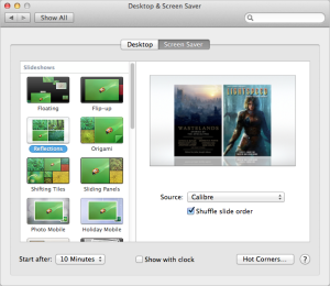
This restores the slideshow behavior from previous versions of Mac OS X; until now, it was inexplicably absent from Mountain Lion (10.8). Missing support for nested folders made it inconvenient to use photo collections organized in folders as the basis for screen savers.
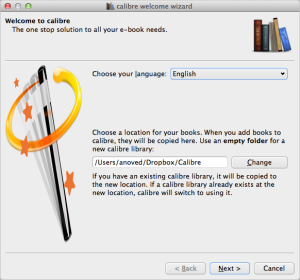
Calibre organizes your ebook files, including cover images, in subfolders of a main library folder. So, now you can select your Calibre library folder as the source for a slideshow screen saver. (If you don’t know where your library folder is, you can re-open the Calibre Welcome Wizard to check the location, as pictured at left above.) The screen saver appears to ignore files that aren’t images, so the result is a slideshow of cover art from your ebook library. This works out nicely if, like me, your ebook library contains many magazine issues with great cover art.
Posted on Friday, March 15th, 2013. Tags: books, mac.
Backups
It’s widely recommended to make regular backups of your files, but until recently that’s been advice I’ve neglected. Now, though, I do have a regular system in place. Here’s the setup:
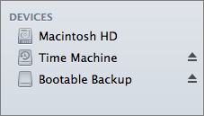 My Mac mini has a 500 GB internal drive. It is connected to an external 2 TB drive with two partitions. One partition is an exact bootable backup of the internal drive, updated each night with SuperDuper. The remainder of the external drive is allotted to Time Machine, which allows recovery of previous versions of individual files. These measures only guard against drive failure (inevitable) and user error (likely). A more robust backup strategy would include off-site copies of these volumes, to guard against local meteorite strikes or other such mishaps. Toward that end, I do store many current projects on Dropbox, and most of my programming-related projects are mirrored on Github as well.
Once set up, this scheme is easy to maintain because Dropbox, SuperDuper, and Time Machine all perform their jobs automatically. I acknowledge that the local backups would not be quite so easily automated (and therefore reliable) if my computer was a laptop, in which case I’d still have to remember to plug in the drive on a regular basis.
I share this not to imply that you should use the exact same backup system, but simply to encourage you to consider whether you have any digital files that may be worth the investment of a little verifiable protection.
Posted on Friday, March 8th, 2013. Tags: mac.
Tcl Doctools for BBEdit
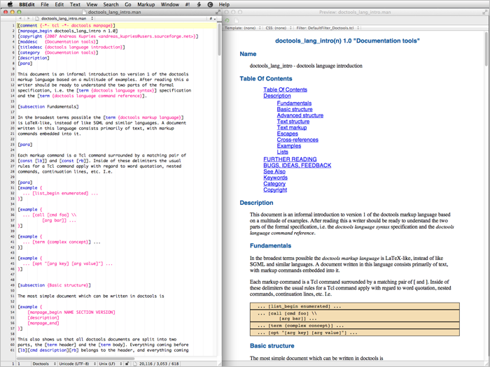
Doctools is a Tcl-based markup language suitable for writing software documentation. BBEdit is a Macintosh text editor. I made a Doctools language module (for syntax highlighting) and preview filter and posted them on Github as Tcl Doctools for BBEdit.
Posted on Thursday, December 13th, 2012. Tags: bbedit, mac, tcl.
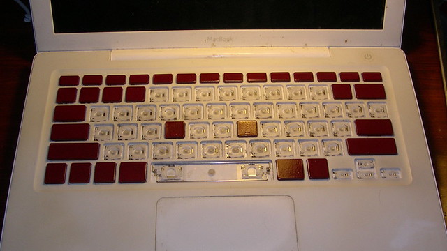
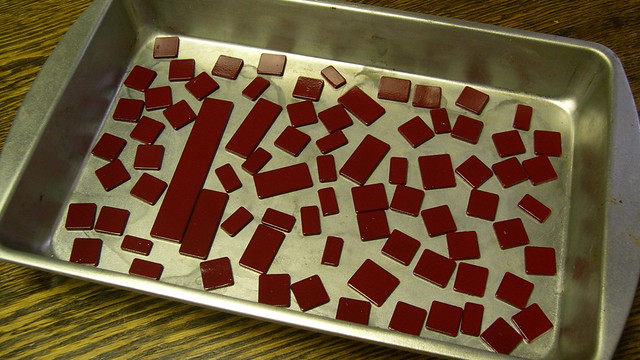
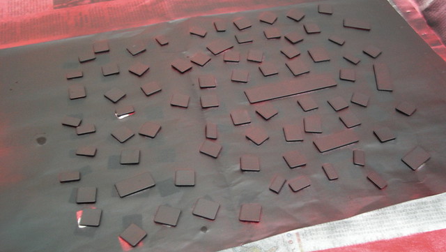
I painted my laptop keyboard
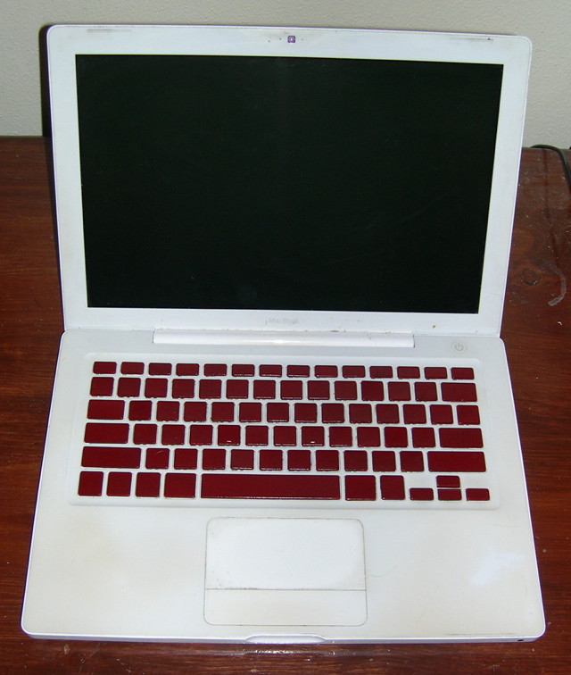
I like it! It’s like operating a computer console from an eighties cartoon.
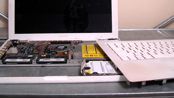
I am now intimately familiar with the assembly and installation of the delicate plastic scissor switches that give the MacBook keyboard its delightful clicky feel. Actually, the scissor pieces are surprisingly sturdy. There are five scissor types: large keys (spacebar, shift, etc.), medium keys (control, option, etc.), normal keys (numbers and letters), function keys, and arrow keys.
I’d wanted to repaint my keyboard for some time, but was only inspired to act after reading Josh Carter’s keyboard painting guide, even though there’s not much similarity between his keyboard and mine. I used cheap model paint instead of the Krylon Fusion paint Josh recommends, so we’ll see how long it lasts.
Posted on Sunday, September 12th, 2010. Tags: mac, macbook.
Bill Atkinson
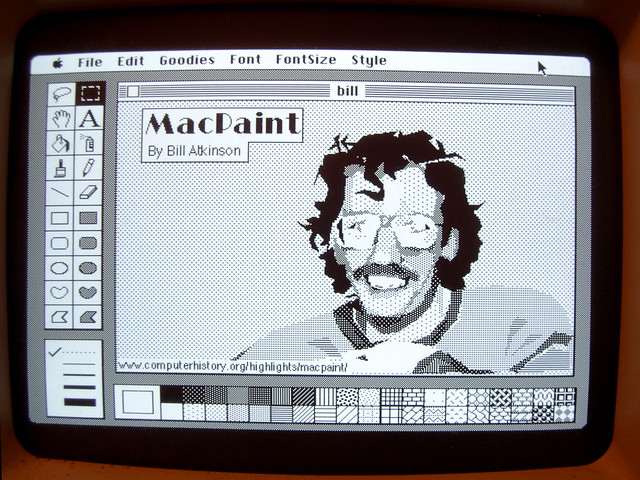
Here’s what I wrote on Flickr to explain this picture:
The source code for MacPaint and the QuickDraw graphics library is now available, as is their story, at the Computer History Museum. To celebrate this news, and to illustrate that great tools retain their utility even as they age, I used MacPaint to paint a portrait of MacPaint programmer Bill Atkinson.
Gruber posted a link to this image yesterday. It’s been viewed over 20000 times in the day since.
Check out Bill’s website for his photography and iOS PhotoCard app.
Prompted by some of the comments on Flickr, I posted some other nostalgic Mac Plus software pictures.
Posted on Friday, July 23rd, 2010. Tags: art, mac.
MacBook Fan
Machine’s fan has occasionally been emitting some unpleasant noises. Fearing a dust buildup that could lead to overheating problems, I took apart the computer and did my best to dislodge and disperse the dust. So far, so good – I don’t think I’d realized how hot and noisy it’d become, because it seems quite cool and quiet now. (Well, relatively speaking; it wouldn’t be a MacBook if you couldn’t flip it over and fry an egg on the bottom.)
Thanks to iFixIt for the excellent step by step disassembly guide. Without it, I’d probably have removed many screws I didn’t have to remove.
Posted on Thursday, June 24th, 2010. Tags: hardware, mac, macbook.
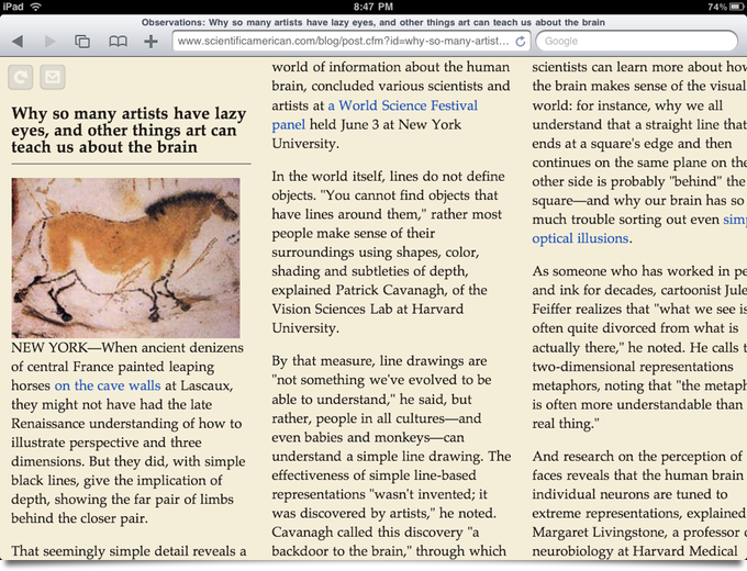
McReadability works with iPad
I don’t have an iPad, but I got to play with one for a while today.
Posted on Wednesday, June 9th, 2010. Tags: code, ipad, mac, readability, safari.
McReadability compared to Safari Reader
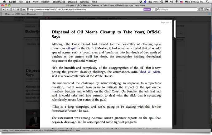
Timely follow-up to yesterday’s multi-colum readability teaser: today, among other announcements, Apple released Safari 5, which includes a built-in Reader feature very similar to Readability. (Update: as Prashant Vaibhav points out in the comments on the Arc90 blog, Safari Reader is in part based on Readability.) Here’s what it looks like:
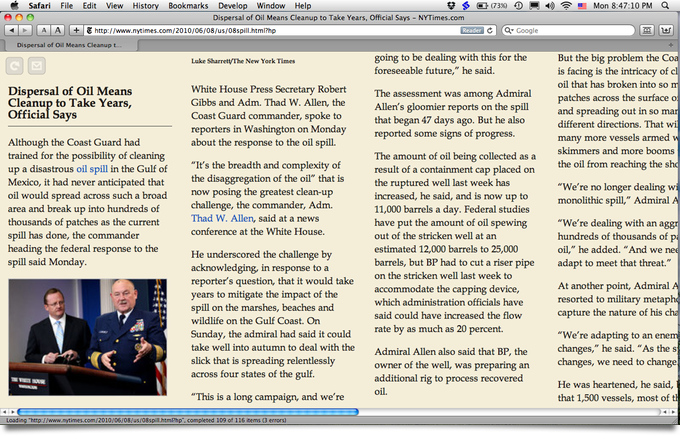
Swanky. I like some aspects of this reader, but I’m not crazy about the fully justified text. Here’s what the same article looks in McReadability:
Which layout you prefer is, of course, a matter of taste. My stylesheet scales down images, if necessary, to fit the column width. Tofu was my inspiration for McReadability. Here is the Amar Sagoo’s argument in favor of the multi-column format (Amar created Tofu):
Text is usually very wide on the screen, which makes going from the end of one line to the beginning of the next difficult. That’s why newspapers have narrow columns: It makes them faster to read.
So why not just take a normal window and make it narrower, scrolling down as you need? Well, there are usually a lot of lines in a text, and all look more or less the same, so if they move past your eyes vertically, they are difficult to keep track of. The text doesn’t feel stable, and you get lost easily.
Posted on Monday, June 7th, 2010. Tags: code, mac, readability, safari.
Multicolumn Readability Preview
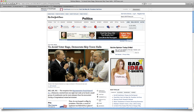
Here’s an article from the New York Times as it appears on my 1920 × 1080 display. There are lots of distractions, but only about one and a half paragraphs of article text are visible.
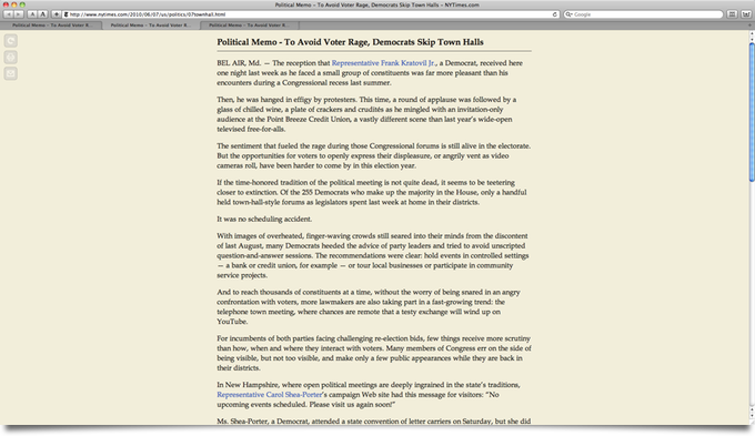
Here’s how it looks with Readability, a great bookmarklet that filters out the crap and presents the content in a simple, elegant, format:
I created an alternate stylesheet for Readability that formats the text in multiple columns, newspaper-style. (NEW! Compare to Safari Reader.) You scroll sideways; in this format, it’s easier to consult more of the article without scrolling.
This modification was inspired by a desktop app called Tofu.
Compatibility
All Readability configuration options are supported, including footnote links. Margin width is interpreted as the inverse of column width (wide margins yield narrow columns). Some column width tweaking and cross browser debugging remains to be done. I know it works in Webkit and Mozilla (Safari and Firefox); implemented with CSS3 Columns.
That’s hot, Jim. I want it.
First I want to check if it’s feasible or worthwhile to submit it as a patch to the original bookmarklet, although there are valid concerns that the column format isn’t appropriate for all types of content that may be viewed with Readability.
Otherwise, I’ll definitely make it available here – although I’ll have to investigate what’s permissible. (I have difficulty understanding the terms of many open source software licenses.) Fortunately, since all my changes are confined to the stylesheet, a normal Readability bookmarklet can be edited to point to a copy of the multi column stylesheet.
Update: Now available.
Posted on Monday, June 7th, 2010. Tags: code, css, javascript, mac, readability, safari.
Torchlight Screenshots
Steam is is like an iTunes Store for computer games. It was recently released for the Mac, and Torchlight was among the first “Steam powered” Mac games available. It’s a dungeon-crawling action RPG reminiscent of Diablo – and that’s a good thing. I have to admit I’ve been playing it quite a bit since buying it as an early birthday present for myself. (I’m also pleased to report that, unlike many other modern games, it runs well on my first-generation MacBook, at least with the “Netbook Mode” setting enabled.)
Torchlight provides a built-in screenshot function to save snapshots of your adventures. The keyboard command is Shift-F9. The screenshots are supposed to be saved in ~/Library/Application Support/runic games/torchlight/screenshots/. However, presently they are written to the torchlight folder with a filename like screenshots\05222010_081129195.png. If you look in ~/Library/Application Support/runic games/torchlight/local_settings.txt, you’ll see that the SCREENSHOT PATH variable includes a backslash, so the path gets misinterpreted as part of the filename on Mac OS X. Fix it to read as follows and your screenshots will be filed appropriately:
SCREENSHOT PATH :screenshots/
I’m sure that was bugging you.
Posted on Saturday, May 22nd, 2010. Tags: games, mac.
