My Top Ten iPhone Games, Haiku Reviewed
I haven’t played many video games in recent years. I upgraded to a Mk. IV Apple Ansible this fall. For better or worse, the quantity of quality games available for iOS has since drawn me back into the fray. Here is a list of ten of my favorite iPhone games, sorted alphabetically by title, and reviewed in signature anoved.net haiku style. Title links take you to the App Store.
Chop Chop Soccer

Bobble-headed tots
compete beneath your fingers –
fakeout, flick, kick, score!
I like the simplicity of the controls and the art style of this fingertip futbol game. (Many sports games present a tedious amount of franchise or roster management – not so here.) If you’ve got the ball, you drag or swirl your finger on screen to dribble or fake out opponents. To pass or shoot, you just flick in the direction you want to kick. To try to steal the ball when playing defense, just flick towards it.
The screenshot about is taken with the “Action” camera mode, but I prefer the “Side” view because the orientation remains stable, keeping input simple.
Fruit Ninja

The Order of Chefs
is sworn to slice ripened fruit.
Swing your cleavers high!
It’s basically like Infinity Blade, except you’re slicing up food instead of ogres and assassins. I think the juicy exploding-fruit sound effects are my favorite part.
Infinity Blade

Weave your sword just so:
thrust and lunge, deflect, cut low.
The God King, the foe.
I feel that this swordfighting game lives up to the hype surrounding its recent release. Powered by the same Unreal Engine showcased in the free Epic Citadel, it’s no surprise that Infinity Blade’s graphics, artwork, and cinematography are top-notch.
Critically, the gameplay is engaging, too. You confront various enemies in a cyclical sequence of duels. (There’s no time wasted trotting about in search of fights, much to the dismay of some among the App Store commentariat. Another thing the comment kids don’t seem to get is that it’s not “over” once you reach or even beat the God King.) Your success, especially against more powerful foes, is reliant on the details of your technique. You can survive by swinging wildly, sometimes, but the real challenge – and reward – is in refining your stroke and footwork to maximize damage dealt while minimizing injuries received. It’s hard to put down – “just one more round!”
Some criticisms: the wheezes, screeches, and grunts uttered by the combatants do get a little tiresome (although my cat seems to like them). In the heat of battle, it can be frustrating when the dodge or block buttons don’t seem to do anything – but this is surely a matter of poor timing on my behalf, not any bug in the game.
Jet Car Stunts

Boost into the blue.
Extend flaps, float, drift and twist.
Rubber chirps, grips – go!
The set-up is zany – you drive a race car with airbrakes and rechargable JATO around geometrical platforms situated in the sky – but the controls are nearly perfect. Steady hands are required to stick the landing on long jumps, but a quick boost or skid will snap you back on track. Just as much a puzzle game as a racing game, Jet Car Stunts nevertheless elicits memories of Star Wars: Episode I Racer, my favorite racing game ever.
Minigore

Hikin’ in Hardland,
huntin’ furry lil buggers
who be huntin’ you.
Minigore is a frenetic “twin stick” arcade shooter that pitches you as hapless protagonist John Gore (or some other character) against unending swarms of fuzzy (and often firey) forest freaks. Individually, the monsters are easily dispatched – but in crowds, they’re overwhelming. Fortunately, your machine gun never runs out of bullets, and if you collect enough lucky charms, you can go nuts and trample the beasties as your own alter-ego beast.
The “twin stick” label refers to games with two [virtual] joysticks, one which controls your character’s movement and one which controls their direction of fire. In other words, you can aim and move in different directions at the same time.
N.Y. Zombies

Building lights are out.
Thump and stumble in the hall.
Pump and shoot ’em all.
There are many zombie survival games out there. This is the one I have. It can actually be quite frightening. I like it.
In each level your task is to stand your ground until the creeps stop coming. You have a small arsenal of weapons at your disposal, which can be upgraded or exchanged between levels. You don’t run out of ammunition, but the weapons do take a moment to reload. You can switch to a different weapon while one is reloading, but if you’re not careful you can sometimes find yourself without any ready to fire – and a few seconds may be all it takes for the zombies to get you.
I think much of the suspense comes from the fact that enemies approach from all directions. This imparts a wary feeling of needing to look over your shoulder, so although your character remains stationary, you must constantly turn back and forth to keep the undead at bay.
Rat On A Scooter XL

It’s Ratty! It’s Rat!
With helmet and Vespa and gas!
Go, Ratty, go and don’t splat!
Rat jumps his scooter from platform to platform collecting cheese. How far will he get before he falls? It’s up to you! There’s just one button: tap the screen to make him jump or, if he’s already airborne and he’s got the gas, to give him a little boost.
The scooter’s motor makes a delightful sputtering sound.
Real Racing
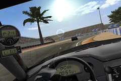
Hug the line, off gas,
nick the curb strip, whip the wheel,
and drop the hammer.
Lots of tracks, four car classes, and a brisk sense of speed make this a great driving game.
Control method B (tilt steering with gas and brake pedals, no brake assist) is the only acceptable input method. Accelerometer steering feels more realistic than any joystick, keyboard, or console controller I’ve used. Cockpit view is important, too. The exterior camera somehow makes the handling seem less convincing to me.
Reckless Racing

Back roads – good ol’ boys
gonna powerslide semis
down in the holler.
Top-down Hazzard county automotive mayhem. There’s a fun variety of cars and trucks to choose from, and detailed scenery to soak in as you gun your buggy through the mud and careen around the farmyard. I like the music.
Samurai II: Vengeance

Artful Eastern land
of lilies, cogs, and honor
wants not for lost blood.
There are nicely illustrated introductions to the chapters of this game, which is itself rendered in an attractive cel-shaded fashion. The “steampunk” feudal Japan setting provides an interesting and generally soothing environment in which to, um, slaughter lots of bad guys. I haven’t quite mastered the timing necessary to consistently pull off the “combo” attacks, so it’s definitely challenging – but that’s a good thing. Your progress is saved after clearing each section of the level, which makes it feasible to work your way through the game in small increments.
Words With Friends

Spell like you mean it –
not just any word will do.
Fear my triple Q.
Words With Friends is like Scrabble, albeit with a different board layout and automatic arbitration of what is and isn’t a valid word. I’m afraid I’m a junkie. My addiction is fed by the fact that you can play multiple games at once, asynchronously, so it’s almost always your turn. Plus, you can take as much time as you want to mull over your move.
Unfortunately, it is also somewhat buggy. The amount of time spent “Sending…” each turn seems disproportionate to the amount of data that must be transmitted. Worse, games occasionally appear to be corrupted and prematurely lost. A “Repairing…” message sometimes appears, but rarely succeeds in restoring these games.
So there you have it, my list of ten favorite iPhone games. Hey, I didn’t say it was a list of ten and only ten games.
In my opinion (<soapbox>as someone who doesn’t pirate software and who happily pays for good software from small shops</soapbox>), iPhone apps are incredibly cheap. Nevertheless, checking in on Touch Arcade once in a while is a fine way to see what games are temporarily free or on sale – I bought many of the games listed above at a discount. “Lite” versions of many games are also available.
No promises (blogs can’t handle commitment), but maybe I’ll review some of my favorite non-game apps, too.
Posted on Sunday, December 12th, 2010. Tags: games, iphone.
NaNoDrawMo 2010 Favorites
Here are a bunch of favorites from the 50 drawings I did for NaNoDrawMo this year.
This year also saw the debut of a new stupid human trick: drawing with my feet.
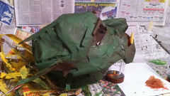
In other arts and crafts news, I made a monster mask out of newspaper and masking tape.
Posted on Saturday, November 27th, 2010. Tags: art, drawing.
Why I Ride
Because bringing groceries home in a car isn’t half as much fun!
That’s just one of many reasons. I was inspired to post something topical by all the wonderful entries in EcoVelo’s recent Why I Ride photo-essay contest. Take a few minutes to browse through the entries. Many of the photos and bicycles are attractive and interesting, but read the accompanying statements, too. Happiness and feelings of freedom are common themes.
Posted on Friday, November 5th, 2010. Tags: bike.
NaNoDrawMo 2010
It’s NaNoDrawMo season. I’ll be posting all my drawings over on Flickr, but a few favorites will probably show up here. Here were some of my favorites from 2009. Chances are good that most will again be portraits.
Posted on Monday, November 1st, 2010. Tags: art, drawing.
Bike Lights
If you ride at night or in foul weather, you would do well to equip your bike with some lights.
In an urban setting, I think the primary function of bike lights is to help motorists be aware of your presence on the road. Since you’re not a salmon and you ride with traffic, a taillight is therefore the most important light in your arsenal. LED lights are bright, affordable, and have excellent battery life. I use an older Planet Bike Superflash.
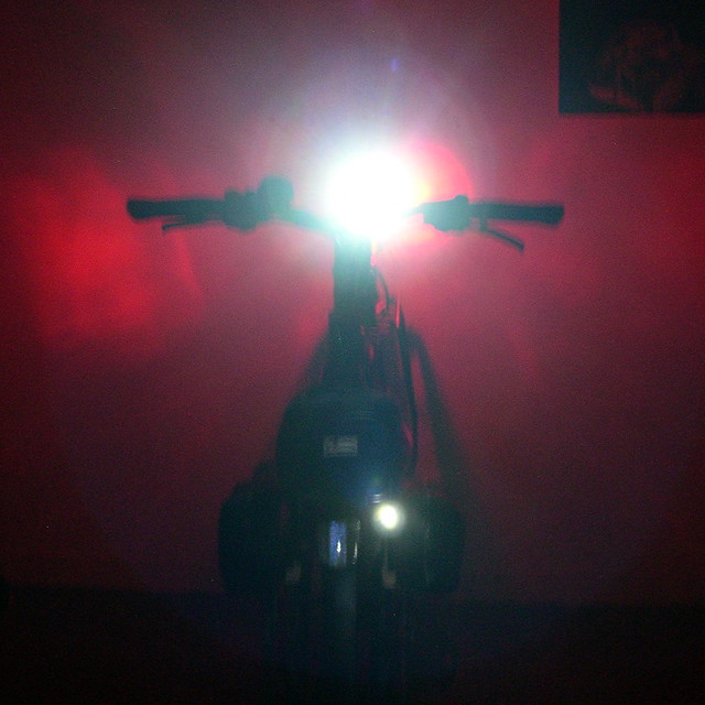
Headlights are important for visibility, too, especially along routes with many intersections or places where cars may enter traffic. Of course, bright headlights can also illuminate the road in places where street lights are absent or insufficient. I’m sure my Cat Eye EL320 is not the brightest headlight out there, but it is bright enough to illuminate potholes, patches of gravel, and the other unseen hazards that lurk along the road at night.
Proper headlight angle adjustment is important if you actually want to illuminate the road, path, or trail. Too high, and the brightest part of the beam will never touch the ground. Too low, and you won’t see obstacles until it’s too late to maneuver around them.
Posted on Monday, October 11th, 2010. Tags: bike.
Balance
Incriminating evidence from a recent weekend visit to an invitingly empty parking lot. Pretty boring as far as AdventureCam™ footage goes, but I valued the opportunity to become that much more familiar with my bicycle’s handling characteristics.
Posted on Sunday, September 26th, 2010. Tags: bike.
Reigning in Readability’s Multi-Page Stitching
Readability’s new multi-page integration feature is great for reading articles that are split into a few pages. However, in some cases I still prefer not to load any additional pages of text. For instance, online ePub readers such as Bookworm, the open source predecessor to Ibis Reader, present one book chapter per page. The chapters are sequentially linked in a way recognized by Readability, so an entire novel could be loaded and displayed if you invoke Readability to view one chapter!
As it turns out, an internal maxPages variable limits how many pages Readability will load. By default, it is set to 30. However, as I suggest, a small addition to the main Readability script will allow this limit to be set by the user via an extra bookmarklet parameter.
If you want to experiment with this yourself, you can modify your Readability (or McReadability) bookmarklet such that _readability_script.src points to the following copy of the script: http://anoved.net/js/readability.js (I’m not going to provide an easy link because I’m wary of using up too much of my low-rent bandwidth). Also add readMaxPages to the list of parameters in your bookmarklet; use readMaxPages=1; to prevent loading any text not on the current page (a link to the next page found, if any, will still be appended).
Posted on Sunday, September 26th, 2010. Tags: code, javascript, readability.
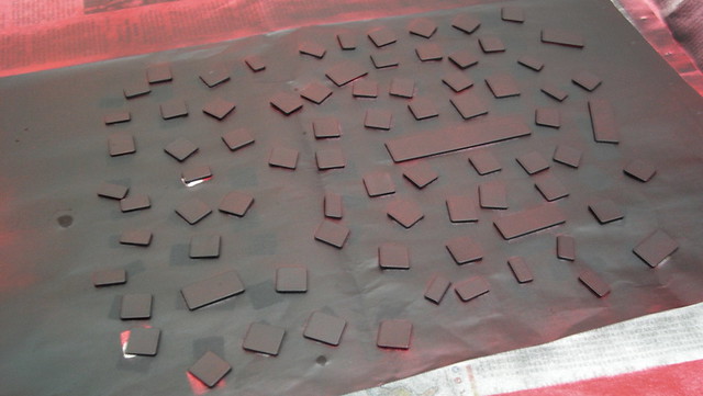
I painted my laptop keyboard
I like it! It’s like operating a computer console from an eighties cartoon.
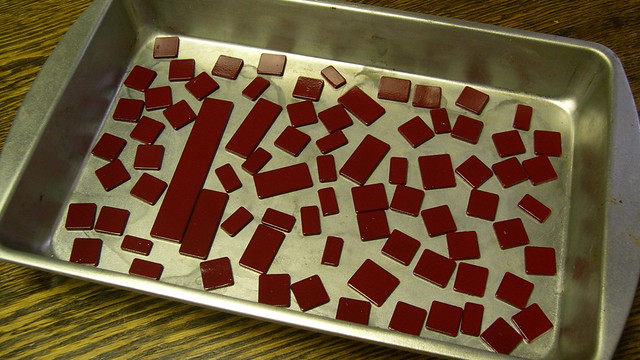
I am now intimately familiar with the assembly and installation of the delicate plastic scissor switches that give the MacBook keyboard its delightful clicky feel. Actually, the scissor pieces are surprisingly sturdy. There are five scissor types: large keys (spacebar, shift, etc.), medium keys (control, option, etc.), normal keys (numbers and letters), function keys, and arrow keys.
I’d wanted to repaint my keyboard for some time, but was only inspired to act after reading Josh Carter’s keyboard painting guide, even though there’s not much similarity between his keyboard and mine. I used cheap model paint instead of the Krylon Fusion paint Josh recommends, so we’ll see how long it lasts.
Posted on Sunday, September 12th, 2010. Tags: mac, macbook.
Used Book Sale Acquisitions
Today was one of the used book sales organized by the friends of the Broome County Public Library. Hardcovers for $1, paperbacks for 50¢! I bought a big stack of books for $5.
What’d I get? Short stories by Isaac Asimov and Robert Silverberg. A regional field guide to trees. More short stories by authors I like. Poems about upstate NY by Dugan Gilman. A history of religion in the US for a friend’s research, and, last but not least, E. O. Wilson’s Diversity of Life.
Not too shabby!
Posted on Saturday, September 11th, 2010. Tags: books, library.
Bike Trip Recap
Last week I took my first multi-day bike tour. I traveled from Binghamton to Sodus Bay on the shore of Lake Ontario by way of Cayuga Lake. It was a blast.
Day 1: Binghamton to Ithaca
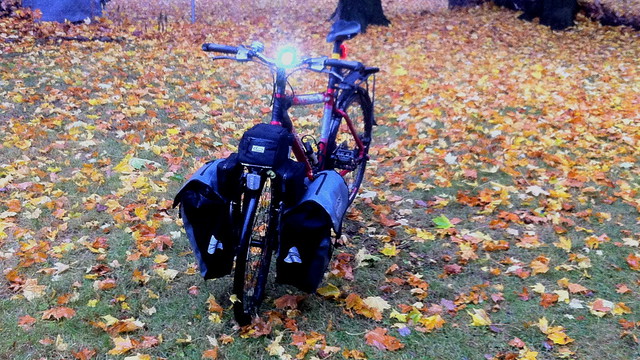
I took a photo of the bike in Confluence Park as I prepared to depart:

I stuck with the same general cargo configuration throughout the trip, with some minor variations. Here’s how the load was distributed:
The big panniers in front held clothing (I brought too much) and foodstuffs (some of which, like my oatmeal, was intended to last the whole trip; other food, such as fruit, I bought fresh each day). The bag over the front wheel held tools, extra bungie cords, and any items that needed to be easily accessible. (An elastic net wrapped around this bag was handy for securing gloves, sunglasses, or bananas where they could be reached without unpacking anything.) The small panniers in back held books, maps, toiletries, and cooking equipment. Strapped to the top and side of the rear rack were my tent
, tarps, sleeping bag, and foam pad
. A water-resistant cover intended for backpacks provided insurance against rain for the most exposed items. Fortunately, I only had to contend with two light showers during the trip.
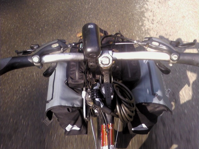
Here’s a picture of the cockpit and forward cargo bay taken while cruising along the Vestal Rail Trail prior to picking up 17C in Endicott. No, that isn’t just an old wristwatch zip-tied to the stem. It’s a velochronometer.
I took a lunch break in Owego to eat some snacks, refill my water bottles, and to check out the new Owego River Walk. I met some interesting people while wandering around the village – the first of many I would meet over the course of my trip. Pastor Wayne makes a respectable-enough effort to greet everyone he meets, but he comes across as some kind of grifter with his smarmy “hey, don’t I know you” patter. On the other hand, the be-goggled and coat-ensconced homeless woman I spoke to in the courthouse park demonstrated an accurate knowledge of the terrain I could anticipate along my route, being an ex-cyclist herself. She was glad to see I was equipped with a helmet, and offered grim allusions to the ruination that could result from a spill such as she once endured.
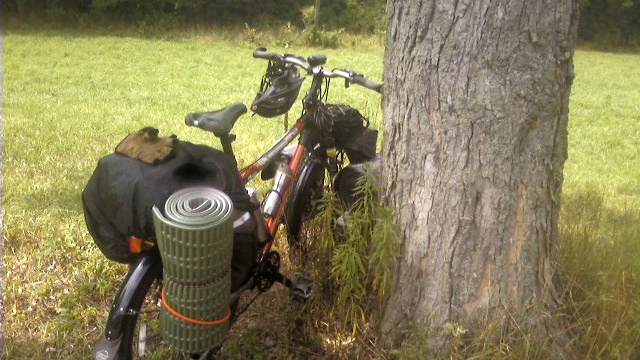
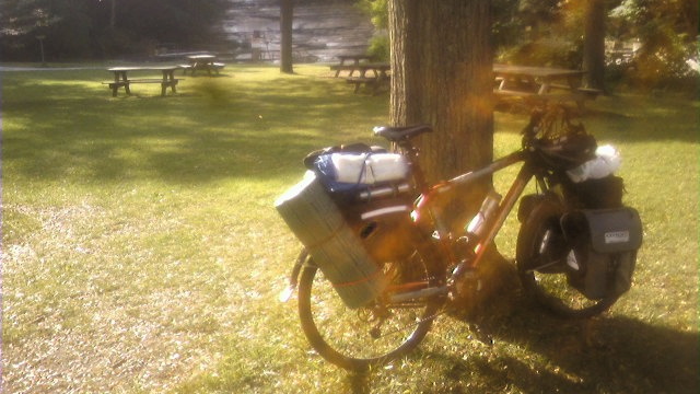
I took two shorter breaks to stretch, snack, and ruminate on the nature of the surrounding countryside as I traversed 96B north between Owego and Ithaca. Here’s a photo of my bike resting against a tree at the first:
I took the second break under a picnic shelter at a parking area a few miles outside of Ithaca. Conveniently, I came upon it just as it was beginning to shower. My plan was to either wait out the sprinkles, or make use of the shelter to ensure everything was snug before carrying on in the rain. Happily, the rain soon abated.
In Ithaca, I met my friend and colleague Rob, who is a resident of that fine town. We rode around to look at a few different parks and neighborhoods before sampling some Purity ice cream.
I camped out at Buttermilk Falls State Park.
Day 2: Ithaca to Seneca Falls
Another photo of the bike, taken near the entrance to Buttermilk Falls just before departure:
As I threaded my way along Route 13 out of Ithaca, a dude in a truck in traffic asked how heavy the bike was. I didn’t know for sure, but fortunately the bike supported all the weight for me – I just had to get it rolling and keep it going! Incidentally, my front racks carry their load very low compared to the bike’s center of gravity and steering geometry, meaning that once underway the bike was extremely stable. Look, ma – no hands! (No, no, not really! I held on to the handlebars the whole time.)
I rode out of Ithaca on the Cass Park trail before putting my traffic game-face back on and heading up Route 89 towards Taughannock Falls State Park, where I took a morning break to air out my plastic ground cloth in the sun and to admire the lake. While thus engaged, I observed a couple prepping their sailboat for a day on the lake. We had a nice conversation about our respective adventures as they strove to shove off on their first attempt to sail the whole extent of Cayuga Lake. We joked that we’d race to the north end of the lake, and that I might win – and given the prevailing northerly winds that day, I expect I probably did!

I made lunch of spaghetti leftovers on the rocks of the breakwater at Dean’s Cove, a little state park boat launch. Fishermen, waterskiers, and other recreational boaters were observed coming and going in the time I was there.

I later had an ice cream cone at Mama Vic’s diner and mini-golf establishment, mainly as an excuse to have them refill my water bottles. It was a beautiful sunny day and I was sweating as only I can sweat. (I am an expert.) Need made that water taste great indeed.
That afternoon I arrived at Cayuga Lake State Park, where I again spent some time relaxing by the waterfront before setting up camp. I met some cyclists from Ohio who were returning (by car, I understood) from a tour of Lake Champlain, taking lightweight day-trip bike excursions along the way. It was fun to compare notes on equipment and packing (although I am sure more upscale cyclists are often perplexed by the odd assemblage of components and discount accessories I refer to as “my bike”).
I also observed an Orthodox Jewish family enjoying a picnic as a tattooed biker chick in a bikini fished, somewhat ostentatiously, from the dock right in front of them. I love America.
No campsites were available in the part of the park nearest the lake, but I did not regret the loss, as I saw that area was a crowded RV ghetto. My campsite was near the back of the park, in a relatively spacious and uncongested area. Stands of brush and trees served nicely to provide patches of shade and seclusion, while retaining an open and airy feel free of the coniferous gloom of Buttermilk Fall’s hillside campsites.

After setting up camp, I zipped into nearby Seneca Falls to take a look around and find some food. As I was searching for a grocery store, I encountered an exodus of vehicles leaving the Empire Farm Days, an agricultural technology exhibition that I remember visiting as a child. Eventually, with thanks to a traffic cop for the tip, I ended up at Sauders store, a bustling Mennonite grocery where I stocked up on fruit and dried food.
Day 3: Seneca Falls to Sodus Bay
In the morning, I passed through Seneca Falls again on my way north. This time, I stopped to take a look at the 2/3 lock on the Cayuga-Seneca Canal, which connects Seneca and Cayuga Lake to each other as well as to the Erie Canal. I spoke to the lockmaster (what a great job title!), who said they transfer about 25 pleasure boats each weekday and as many as 60 a day on weekends.

En route to the lock I passed the house of Elizabeth Cady Stanton, a leader of early women’s rights movements in the United States. She was an organizer of theSeneca Falls Convention, which yielded the well-known Declaration of Sentiments. (Did you know that Frederick Douglass was present?) Various related parks and sites are marked throughout Seneca Falls, and the historic downtown district is home to shops and agencies that reflect that history.
While I found the town of Seneca Falls itself quite interesting and attractive, its northern outskirts are home to Seneca Meadows Landfill. “Landfill” is perhaps not an adequately descriptive term for what they’re building there. It’s a mountain of garbage. A pyramid packed with trash is a sad monument for future archeologists to unearth. Even worse for me, the landfill attracted dump trucks like a carcass attracts flies. As a cyclist, dump trucks are perhaps my least favorite vehicles.
Once I was north of the Thruway, however, traffic declined and 414 took on a distinctly pastoral character. Although the Finger Lakes region is well known for its wineries, it is in the flat land between the Finger Lakes and Lake Ontario that I saw the most vineyards and orchards.
I passed through a town called Clyde.
Then, sooner than I expected, I arrived in the vicinity of Sodus Bay – the destination of my trip. I checked in to Lake Bluff Campground to deposit my gear. I hoped to set up camp early so I could proceed to explore the area at my liesure. Here’s a Google Earth view of Sodus Bay and the surrounding places I mention here:

After pitching my tent, I ventured down the road to Chimney Bluffs State Park, where I could finally see the waters of Lake Ontario. Here I allowed myself a bit of self-congratulatory pride for biking so far.
I was eager to explore the park, but it was beginning to rain, so I hastened back to the campground and deployed my secondary tarp. Predictably, once I expended the effort to secure myself and my belongings against the threat of sogginess, the showers relented. It was worth doing, however, as I found the second tarp did help to minimize dew. It also provided a pleasant extension to the space encompassed by the tent, and some additional privacy from the surrounding seasonal RVers. (In the picture below, one corner of the tarp is attached to my bike – but I ended up securing it to a tent stake instead.)

Anyway, once my base was properly fortified, I returned to CBSP and hiked up the trail that lead to the bluffs. What a cool place! My cell phone camera does not really do it justice.

The knife-edged crests of bluffs themselves are impressive examples of erosion at work.
I was equally enamored with the footpath that lead through the forested area above the bluffs. The dirt path was packed smooth by the passage of many feet – in fact, I walked part of it barefoot – but was often fringed by overhanging growth and veined with roots and small gullies. Somehow, this sort of “old road” environment really stimulates my imagination – perhaps it just resembles what I envision when I read Tolkien-y tales of journeys through half-enchanted wilderness.

All in all, a fittingly mysterious and majestic turning point for my journey.

Day 4: Sodus Bay back to Seneca Falls
Based on my early arrival in the Sodus Bay area on day 3, I knew it wouldn’t take long to ride back to Cayuga Lake State Park, so I planned to stay in the Sodus Bay area through the morning and early afternoon of day 4. I rose early and journeyed around to the west side of the bay, where I arrived at Sodus Point beach by 9:30.
Here’s a picture of the current Sodus Point lighthouse (on the left) and its predecessor (on the right). As I learned from a few conversations I had near the current lighthouse pier, at the time of the original lighthouse’s construction, the point did not extend to its current location, so the old lighthouse was indeed then located at the tip of the point. Although the new lighthouse is taller and no doubt brighter, it’s certainly situated less attractively than the original.


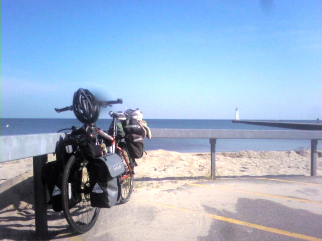
I think I spent most of the morning in conversation sitting on the guardrail by my bike at the spot pictured above.
Besides a few brief exchanges with walkers (of the dog and non-dog variety), I had a wide ranging conversation with a pleasantly quirky fellow who rode up on a recumbent bike. We talked about bikes, of course, as well as rail-to-trail paths (including the one from Pittsburgh to Washington, D.C.), universities, points of interest in NY and Ontario, and other topics. I was slightly alarmed by the graphic detail of the bike saddle horror story he told in celebration of recumbent bikes – but I must confess his bike’s recliner seat looked like a mighty comfy way to ride long distances.
As we were talking, a third fellow who had been sitting in his truck nearby entered the conversation. He brought up a potentially contentious point: his frustration with inattentive cyclists who were often startled – and prone to react indignantly – by the inaudible approach of his hybrid Silverado. My fellow cyclist soon departed, clearly having little interest in entertaining such gripes, but I acknowledged the validity of the silent-hybrid problem. After all, I rely greatly on my sense of hearing to ride safely in traffic – and am not at present equipped with a mirror.
It was informative for me to recognize that the “living history” hobby isn’t just about camping in Civil War costumes, but also about actively piecing together observations, anecdotes, and artifacts with the written record to hypothesize a more thorough understanding of events.
I was rewarded for my nuanced acknowledgment of the issue with a conversation that unfolded into a richly detailed history lesson of the Sodus Bay area – and a discussion of many other meaningful topics, such as intangible measures of success and the value of time and self-reliance. It turns out this chap was quite a dedicated history buff who was spending time at the Point that morning to envision how the geography of the bay and the original point must have influenced the outcome of certain battles during the War of 1812. It was informative for me to recognize that the “living history” hobby isn’t just about camping in Civil War costumes (although that’s part of it, too) – but also about actively piecing together observations, anecdotes, and artifacts with the written record to hypothesize a more thorough understanding of events.
As an example, he described the discovery of a certain type of carpenter’s ax in the soil of a garden on the site of a settlement razed in battle. Given that an ax blade of that type would have been of considerable valuable, the fact that it was abandoned rather than later retrieved from the site suggests that the residents fled in haste and for good, without preparation or the possibility of return. Whether that or any such interpretation is completely valid I can’t say, but I was impressed by the “blue-collar scholarship” evident in his reasoning.
I also learned about Preemption Line (which bisects the bay) and we discussed ways to test how the different versions of the line might have been surveyed (e.g. via magnetic or polar north).
Anyway, after that I spent some time reading Revelation Space and hanging out on the beach. For lunch I had a summer “Dog Days” special from the concession stand – hamburger, french fries, salt potatoes, beverage.
The weather was glorious this day, and exceedingly conducive to hydrothermoregulation on the ride back to Seneca Falls. I did stop to take a picture of these giant vats of vinegar at Fleischmann’s facility near the town of Rose:

Day 5: Seneca Falls back to Binghamton
Not too many pictures from this day. The initial plan was to backtrack the day 2 route and return to Ithaca.
As I was packing up to depart from CLSP, I saw a whole family departing on loaded touring bikes. I regret that I hadn’t noticed them or had a chance to say hi earlier – I bet theirs was an interesting story. (Also, ladies, don’t be jealous, but wow – that mom had some legs.)
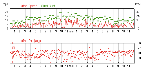
Saturday (Day 5) Wind Log for Interlaken, NY
I took Route 414 south from Seneca Falls as far as Ovid, NY. I reasoned that having already traveled the scenic Route 89 byway on the way north, the straight, flat, broad-shouldered 414 would make for a fast return ride, yielding plenty of time to enjoy a weekend evening in Ithaca.
Well, in some sort of meteorological comeuppance for gloating about the northerly headwind my sailboat friends faced on day 2, I had to deal with a punishing headwind all the way back to Ithaca. It felt like climbing a hill with a flat tire for miles on end! After four days of relatively easy riding, I was humbled to feel so deflated on what appeared to be such forgiving terrain.
Anyway, here’s an obligatory picture of Taughannock Falls from the upper overlook as I made my way back into Ithaca:

So, while I was at that overlook I called ahead to see if any campsites were available at Buttermilk Falls. Since it was now the weekend, I anticipated they would by busy – and indeed they were booked. Robert Treman State Park was also booked. It was at this point, I think, that I made a decision in defiance of my morning struggles with the wind – but, in order to manage my physical focus, I wasn’t quite ready to acknowledge what I’d decided.
In Ithaca, I walked my bike around for a bit before finding my way to the bustling farmers’ market, where I had some cider and a delicious Solaz burrito. After relaxing and people-watching for a while more, I tanked up the fuel cells with some foul new strain of Gatorade (but it was on sale!) and tackled the climb south out of town – which turned out not to be as brutal as I’d feared. It helps to have untapped reserves of low gears (seriously – thanks to my ride’s mountain-bike heritage, I’ve never used its lowest gear out of necessity) and latent reservoirs of kill the hill ferocity developed during your years as a cross country runner.

So, I continued on to Owego – surpassing my previous one-day distance record, set on day 1. I rode around Hickories Park campground, where I’d stayed once before, as a token nod to the sensible idea of camping there for the night. But it was sort of crowded, and I was definitely experiencing a second wind of energy and ambition.
I wolfed down a burger at a nearby McDonalds (my favorite fast food restaurant, and I don’t care what you think), activated my full complement of blinky lights (dusk was approaching), and set out for home. I rode quickly! As a result, I arrived home a day earlier than planned, and eclipsed my previously one-day distance record. If I didn’t travel 100 miles total that day, it was pretty close to it. (I know that a “century” isn’t that big a deal for more experienced road cyclists, but it was another big milestone for me.)
Budget
This might be of interest to others trying to plan a similar entry-level bike tour. I allotted $180 of my scant resources for this trip, but it was well worth the money. Roughly half was dedicated to campground fees ($25/night at Lake Bluff; state parks are around $17 on nights before weekdays and $21 on weekends). The rest was for food. I finished under budget, thanks primarily to finishing a day earlier than planned.
Ways to travel even cheaper would include back-country camping (parks and campgrounds offer the luxuries of potable water, bathrooms with showers, and access to other services if needed) and being more strategic and frugal about food purchases. For me, though, a bit of indulgent spontaneity in grocery shopping is a pleasure I planned for (“Oh! A gallon of lemonade, on sale? And these strawberries look good, too!”).
Observations
Bike tours are fun. You meet interesting people, and are treated with interest yourself in two regards. First, as a road user, I felt that I was accorded a greater degree of respect and attention from motorists than unladen cyclists typically receive. Second, and perhaps more subjectively, as a traveler I felt more welcomed by residents and employees than what is extended to tourists.
I recall the verdant smell of certain valleys, the view from hillcrests not marked on any maps of scenic byways, and so many homesteads and human enterprises I passed at a pace that actually allowed me to wave, nod, or say hello.
Bike touring also underscores something I value about biking around town, and which I think can be pursued in all experiences and life choices. This is the value of small places: the interesting people, landscapes, and landmarks that fundamentally connect better-known points of interest. Geometrically, these are the uncountable points that lie between each pair of integers on the number line, not the coarse countable infinity of integers themselves. These are the wonders unseen by the impatient and poseur-cosmopolitan. I have described this trip as a series of landmarks and destinations, but I know the places between those landmarks, too. I recall the verdant smell of certain valleys, the view from hillcrests not marked on any maps of scenic byways, and so many homesteads and human enterprises I passed at a pace that actually allowed me to wave, nod, or say hello.
Upon my return, it was with some interest that I read this NYT article (and related videos solicited from readers) about a neuroscience camping trip intended to elicit discussion of the issue of constant connectedness. Now, I was not really “off the grid” during my trip, since I carried my cellphone – and even tried posting comments and photos to Twitter throughout the trip. But I didn’t browse the web, didn’t check my email, didn’t scour my RSS reader, and found I didn’t hanker for those habits one bit.
In conclusion, I had a good time. But do you know what would have made the experience even better? Sharing it with friends. So if I know you, and if you know how to ride a bike, expect me to someday petition you to join me on another tour.
Posted on Tuesday, August 17th, 2010. Tags: bike.


