Tag Archive: “geography”
Creating Heightmaps of Large Regions
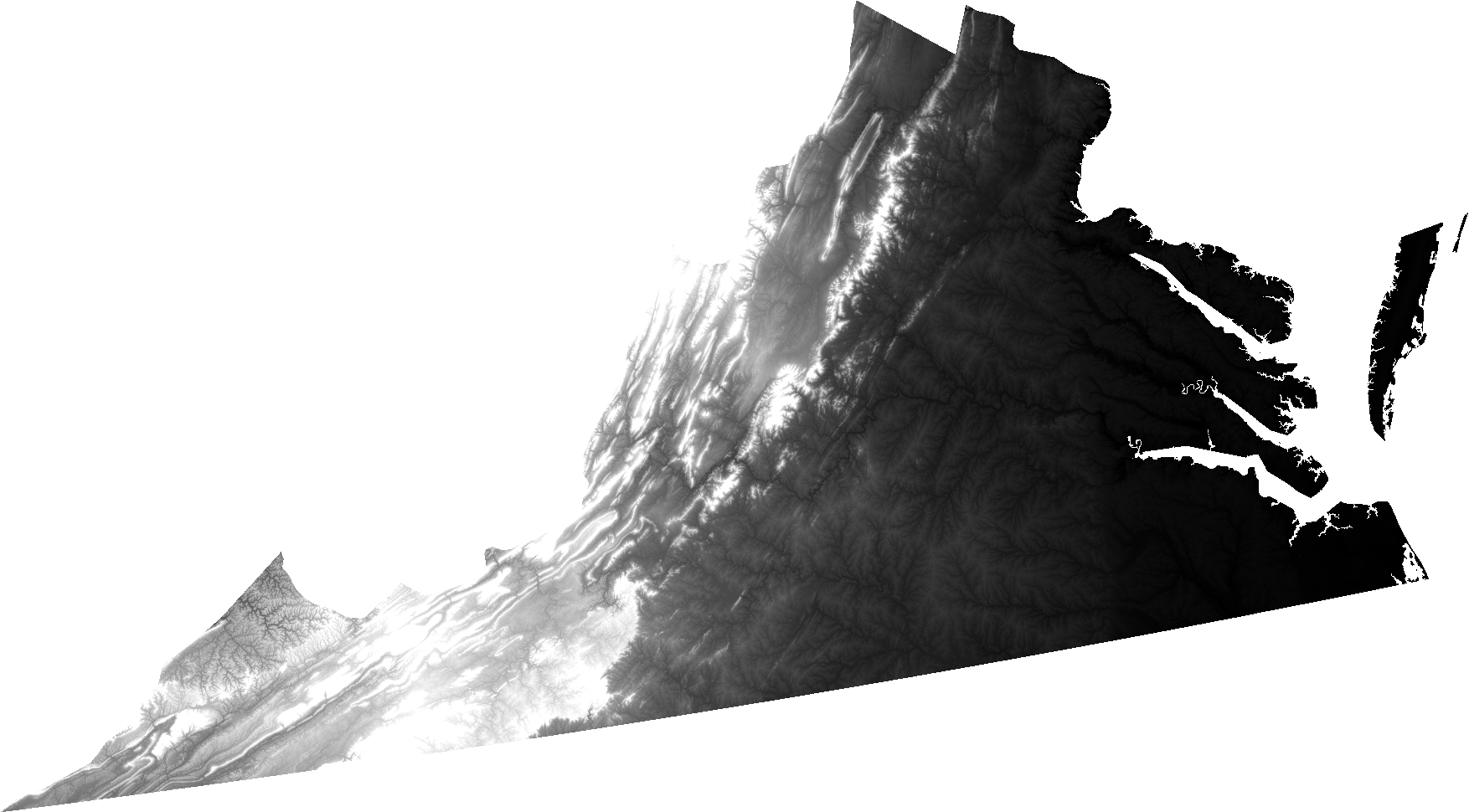
An open question from Josh Ajima about making 3D printable models of Virginia prompted me to consider the general problem of finding a suitable elevation dataset for a large region like a state.
@DesignMakeTeach Here’s a start. (https://t.co/qS9F9kWMeQ clipped to state boundary & saved at quarter res. in QGIS) pic.twitter.com/hmwwX7dj6U
— Jim (@anoved) September 28, 2015
In this post I will explain how I made the image I posted in reply, using free tools and data.
Posted on Tuesday, September 29th, 2015. Tags: 3d, geography.
Combining Course and Terrain Models with Boolean Modifiers in Blender
I don’t know jack about Blender, the free 3D modeling program, but I have found it useful for combining pieces of my 3D printed landscape models. It performs boolean operations quickly and produces clean output (valid STL files). However, the interface is notoriously intimidating to new users – myself included – so here is a screenshot-illustrated guide to the process I’ve worked out to make a few types of route + landscape models.
This is not a general-purpose tutorial. It is focused on the task of combining an STL terrain model with an STL course model. Both inputs are assumed to exist and to be pre-aligned at the same scale and orientation. (I will explain my process for creating those models in a subsequent tutorial.)
Posted on Thursday, July 30th, 2015. Tags: 3d, geography.
Orbits in 3D
I’ve been playing around with ideas for a new satellite tracking web site. The main idea is to supplement a conventional 2D ground track map (like what I made for Where’s That Sat, or as often seen on the big screen at mission control) with a 3D view that displays the same orbits as paths swept out around the globe. I believe that seeing the actual shape of an orbit in space helps you to interpret the corresponding flat representation. So, there is even an eccentric pedagogic purpose to this project: it is an instructional aid for developing orbital map-reading ability.
Here’s an example:
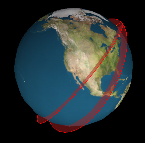
The code to generate this image is crude, but the results are already encouraging.
Posted on Thursday, July 11th, 2013. Tags: geography.
An arcencode example
Arcencode is my Tcl implementation of the compression algorithm used by both MapQuest and the Google Maps API to encode a list of coordinates as a printable string. It can be used, for example, to obtain a relatively compact representation of a route that can be passed as a single parameter value to a web map.
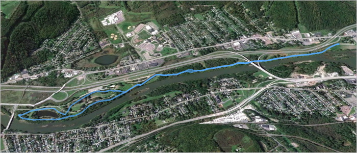
Here is a GPX file exported from a map created with MapMyRun. It contains a track representing a route through a nearby park, pictured above. The track consists of 790 points, listed here in plain text form. If the contents of that plain text coordinate list are assigned to a variable named coordinates, the encoded form can be obtained with:
set encoded [arcencode $coordinates]
With line breaks added, the contents of encoded are:
q}g`GrlfnMPDND\DJ?L?T?P?N?N?N?P?VAPANANAPANAPANATGNELGXENANANCNANA^BNDPDNBNDNDND
NDPDNDNBNDNDPDNDNDNDVHNFPFNFNFNFPFNFNFNFPFNFNFNFPFNDNFNFPFNFNFNFVFNBPBNBNBNBVFND
PDNDPDNFPDNDPDNDPDNDPDNDPDNDPDNFPDNDPDNFPFNDPFNFPFNDPFNFPFNDZLHFJDNFPHNFNHPFNH\F
LAJ?V?F?PFNFNDNFNHZNLHNHLHLHLHNJLHLHT?N?PAN?PAPAVDPFNDNDPDNFNDPDNDNFPDNDPDNFNDPD
ND\JLDNBNDLDNDNBTFNDLBLDVDN@PBN@PBN@PBNBP@XHNHLFNHNFNFLHNFNFPVBNPVJFHHRLHFPANCPC
PAPAR?L@R@P@P?N@P@P@P@P@VFLDLFRHNFNFPFNFNFNFNFNFNFTLHFLPLNJLRTJHPJJDPBTAJCPGPGNE
PGNGPGNGNEPGNGPGNEPGNGNGPGNEPGZIJAJAVJLDLDRAPENCPCNCPENCPCNEPCXGNCLCNCNCPDPHTTJJ
HLHJLNJLLLRLLBPFRNJLJJJLJLTHL@T@L?N@THLHLHLHNLNJLLLJNJ\LL@N@N@L?N@ZALENCLCNENCRI
NGNELGZKNGNGNGNGNGNGNENGNGNGNGNGNGNGTUFQHOHOFQN[HOFMPYHKHINQJKLLHRHPHPHRJPHPHRHP
J^BPDRDPDVJVHNHPPNNJLHLHLJRFPFNDNDPFNDNDPFXHLFLDLDRFNFNDNDRBNBN@RENCPEPCNEXCH@P@
VJJHHHFBEWCSEUGSIUO[KOIMIMUWKMMKMMKMMMMKKMMMMMSMOGMIOIOGOIYQMIMIMGMIKIUMMKOIOKMI
OIOKMIOIOKOISKOEMGOEUCOCQAOAQCQAYCMAMCSEOEOEQCOEWCM@WBMBOBODOBUJMFMHMHMLOJMLWPMF
MFMFWFMBOBODYBO@O?O@O@O@SCOAOCQEOEQEQEOGQEOGWGMAU?M@O@QDODQBWFQBOBO@QBOBOBQBOBSB
O@QB[DOBOBODOBOBOBOBUDQDOBOBQDOBOBW?KEQGMGQ@QBQFOD_@NODOFODOFOFODOFODOFODOFOFODO
FODYJK@Q?SGKCOMKKQQKMKOKMOKUMOGOGOGOGOGOGOGQGOGWKIEOGWEQ?OAQAOAQ?OAQAOAQ?W?SGIIK
GKOKQMOOMMISCUHGFQGOGOIOGOIOGOIQIOGUGQAOCQAOCQAOCQAOC[GOEOEQEOCOEOEOEOEOEOESEOGQ
EOEQGOEQEOEQGUGOEQGOEOEOEQGOEU?Q?O@Q?O@O@YIOIMKMIOIMIOIMIMKQGQGOGOGOGYEM?M?Q@[GM
GOGMGMGMGUIMGOGWMKEMCQIQEOGOGQEOGOGOGQE[KQEOEOEQEOEOEQEOEOEQEOEOEQEOEOEQEOGOEQEO
EWEOCQCOEOCOC_@KOGOGOGOEOGOGQGOGOGOGOGOGOGOEOGOGOGOGOGOGOGWGOEQEOEQEOEQEOEQEOEQE
OEQEOEQEOE[AK@M@Q@Q@OBQ@QFOFOFWBO@Q@O@Q@O@Q@Q@U?O?Q?Q?O?Q?Q?O?]CKEMCME
Succinct, considering it encodes detailed geometry. A coordinate list of 790 corresponding points can be recovered from this block of text with the complementary arcdecode procedure:
set decoded [arcdecode $encoded]
The decoded coordinate list can be examined here.
An important proviso: this encoding scheme is lossy. Specifically, coordinate values are rounded to five decimal places. Compare the input coordinates to the decoded output for an example. Any precision can optionally be specified, but greater precision compromises the amount of compression. (Note that the Google Maps API is only compatible with five-digit precision).
How does this algorithm work? Google offers a technical step-by-step explanation. Essentially, compression is achieved by storing only the difference between each coordinate value and the previous value in the sequence; this requires fewer digits than storing each value in full, especially since precision is limited to a fixed number of digits. The values are packed into a printable Base64 representation in a way that eliminates the need for delimiters between coordinate values: values are bit-shifted left before output, and the ones place is used to mark whether the subsequent character represents a new coordinate or a continuation of the same value.
I updated my WheresThatSat site to use JavaScript and (on the Twitter bot side) Ruby implementations of this algorithm. It’s an appropriate application – previously, satellite ground tracks were encoded as a repetitive sequence of separate point parameters. In addition to yielding somewhat shorter URLs, this compression method ensures the correct point sequence is preserved even if the URL parameters are re-ordered.
Posted on Sunday, March 3rd, 2013. Tags: code, geography, tcl.
GIS Stack Exchange

GIS Stack Exchange is a question and answer site dedicated to helping people figure out GIS (geographic information systems) problems. It’s part of a larger Stack Exchange network of Q&A sites about various topics.
I received some helpful replies in response to a query I posted earlier this year, and have found useful information there as a result of other searches, too. So, in an effort to “learn by teaching”, I’ve decided to try contributing answers on a regular basis (at least weekly). I’m not qualified to address most of the topics that come up, but there is a large backlog of unresolved questions to peruse, and I’ve already found a few of interest. Even if I can’t provide authoritative answers, I hope that providing pointers to relevant references might help people figure things out.
Here are the comments I’ve offered so far:
- Cartograms: making base maps and facilitating size comparison (previously, here)
- Shapefiles: clarifying whether polygon features may intersect themselves (no)
- Projections: finding an implementation of space oblique mercator (PROJ.4 supports a Landsat-specific subset; sparked some more ideas for gtg)
One of my answers even got an upvote! So, yay. My geography degree was good for something.
Posted on Tuesday, December 11th, 2012. Tags: geography.
WheresThatSat

My Twitter bot @WheresThatSat is up and running. More information about what it does is available at WheresThatSat.com. In short, it replies to comments about satellites with maps and information about the satellite’s recent course.
Posted on Wednesday, April 25th, 2012. Tags: geography, gtg, wheresthatsat.
WheresThatSat Preview
As I’ve mentioned a few times, I’m making a bot called WheresThatSat which is basically a Twitter interface to Ground Track Generator, my satellite-path-mapping program. The bot responds to queries about satellites (it knows of many – you might even say it has detailed files) by reporting their location at the time they were mentioned.
This week I’ve been making a complementary web site that displays more information (altitude, speed, heading, etc.) along with a Google Map rendition of the satellite’s recent path. The bot will include a map link with each response. The site isn’t finished yet (some icons and styles are still placeholders), but here’s sneak peak:

My goal is to get things working smoothly enough to let WheresThatSat resume running later this week, at least on a trial basis. Although the bot could search for and reply to any mention of the many satellites it knows about, I’ve decided it will only post unsolicited responses to a sample of tweets about one or two “in the news” satellites (queries explicitly addressed to @WheresThatSat will, of course, have access to a full catalog of satellites). This is partly a matter of manners and partly a matter of avoiding excessive API calls (Twitter imposes rate limits on how frequently programs can interact with it).
Posted on Sunday, April 22nd, 2012. Tags: geography, gtg.
Exploring Orbits
A ground track comparison of Sun-synchronous satellites in low Earth orbit and geosynchronous satellites in high Earth orbit.
Posted on Tuesday, April 3rd, 2012. Tags: geography, gtg.
Making Ground Track Generator
I wrote a little program to make shapefiles (GIS map layers) of satellite ground tracks. Here’s the story of its development, recounted from my comments on Twitter (the internet’s water cooler).
Posted on Saturday, March 31st, 2012. Tags: code, geography, gtg, math.
Intro to GIS Presentation
Here is a presentation I created a few years ago to accompany a little talk a gave to the lab group I was working with at the time. Members of the group had acquired some ad hoc GIS experience, but I felt they would benefit from a higher-level overview of common “geographic information systems” concepts and operations. The presentation touches briefly on a number of topics and includes a variety of example images (mostly uncredited, unfortunately; intended for educational purposes only). I have omitted the final slide, which was a segue into a discussion of specific projects within the group. I hope you will find the rest of the slideshow presented here useful.
Posted on Thursday, February 23rd, 2012. Tags: geography.