Fixing FileMaker Server Web Start
I recently installed the Java for Mac OS X v10.5 Update 4 on my computer at work. Today I had trouble logging in to the administrative interface for our new FileMaker Server, which is launched as a Java Web Start application. After fiddling with it for a minute, I found a recent post by John May confirming the problem is related to the Java update and offering a solution.

Choosing to open a .jnlp file with the Java Web Start application.
In the “Get Info” window for the web start file, select “Other…” from the “Open With” menu and choose the Java Web Start application found in /System/Library/CoreServices. Problem resolved.
Posted on Friday, June 19th, 2009. Tags: filemaker, mac.
Detachable Baskets
I rolled this old step-through bike pretty frequently over the past year. With the addition of a simple Nashbar rack and some cheap baskets, it made a great grocery-getter.

Baskets on the old blue bike.
I attached the baskets to the rack with a battery of zip ties. Many ties along the top distributed the weight of the load. One or two ties at the bottom of the baskets kept their frames held snugly against the rack supports.

Baskets attached to bike rack with zip ties.
I gave the blue bike to my sister, but I kept the baskets. They’re handy, but admittedly a bit cumbersome to ride around with all the time (although at the rate I accessorize my bike, you wouldn’t think it’d matter). So, inspired by an Instructable about backpack panniers, I devised a simple 24″ bungee cord detachable basket mounting system.

Basket adapted to attach with bungee cord. Detachable!
The basket’s weight is supported by the base of the hooks. The bungee cord is kept taut by looping it under the tabs found at the base of most racks, and the basket is again stabilized by strategically placed zip ties. Hot swappable bicycle luggage!
Posted on Thursday, June 18th, 2009. Tags: bike.
Popular Reference
Yesterday I was thinking about how to make maps more accessible by adding reference features to the display. Today I realized that since Google Earth is such an excellent reference tool – replete with imagery, street maps, and the captivating advantage of seamless navigation – the problem of anchoring the data might be resolved by presenting it in that context. As a trial, I used the ArcToolbox Layer to KML conversion tool to save some maps in a compatible format.

Sample choropleth map viewed in Google Earth.
I think this is a useful way to lead a discussion about a place. We can present our data, yet easily and actively explore other aspects of the environment. A playful approach is engaging, and can have serious benefits: it is important to ask questions like “is this the right data?” or “what else is going on here?”. I feel this exploratory attitude is appropriate in my situation; when I present our data, I want to inspire the group to think about possible applications and variations.
The sample map pictured above is faulty in that no legend is displayed. I think it is possible to include a legend, among other things, in the KML file. I look forward to getting up to speed on Google Earth & Maps technology. I expect that in the future more Binghamton Neighborhood Project data will be made available online in this way; Google even encourages projects like ours through Outreach.
Here I advocate using Google Earth as a venue for presenting conventional choropleth maps because of the ease with which other reference layers can be explored, providing context for the data. I agree with Mark Harrower that three dimensional thematic maps (porcupine globes) are generally unsuccessful, but the debate is interesting, so check out the relevant posts by Bjørn, Leszek, and Rich.
Rich concludes with some points that reflect my own reasons for enthusiasm about this approach. In particular, he gives this example:
Draping a thematic map over topography can be a useful visualisation e.g. polygons showing erosion rate draped over a range of mountains, by eye you could then relate erosion to slope.
The sample map shown above happens to be “Percent Tree Cover” by census block. With Google Earth’s Terrain layer enabled, it soon becomes evident that the hilltops are the most heavily forested areas around the city. I am curious what other neighborhood relationships the group will uncover when we explore our demographic data!
Posted on Thursday, June 18th, 2009. Tags: geography.
Reference Features
Next week I will help present some Binghamton Neighborhood Project data to a small committee of people interested in the state of our city’s South Side. I will be showing maps of various demographic measures collected by the BNP, addressing the question “who are the residents of the South Side?” and demonstrating the project’s ability to develop knowledge about neighborhoods.

Binghamton's South Side as viewed from Google Earth.
Today I have been thinking about how to present these maps. Spatially, the lowest common denominator for our data is the census block group. I will use census block groups as the enumeration unit for my thematic maps.
However, in this case I don’t think it is sufficient to just plot the data. Few people are familiar with census geography – you may recognize the shape of your nation or state, but do you recognize the shape of your census tract or block group?

U.S. states are easily recognized.
If the purpose of a map is to complement the viewer’s knowledge of an area, it is the map’s function – and the cartographer’s responsibility – to link the data to the viewer’s conception of the place. If the enumeration units are easily recognized – states, counties, etc. – then no further context is needed. If the data is organized at an unfamiliar resolution, additional reference features are needed to root the map in the viewer’s world.

Binghamton block groups are not so familiar, even to local residents.
Reference features can be streets, labelled landmarks, or natural features. Boundaries of more familiar regions can be informative, too, but if the region of interest is small and falls entirely within well-known borders, physical features remain the best reference. Especially pertinent are those features people encounter in their daily activities.
I think this sort of context has been absent in previous presentations of BNP data. The project has generated plenty of interest in the community, but little sustained engagement. I suspect the idea seems inspiring, but the information bewildering; it’s hard to act or base decisions on seemingly arbitrary patterns.
Our goal is not to share what we know about block groups (or any other artifact of data collection), but to share what we know about neighborhoods – places associated with homes, schools, businesses, and the routes we navigate. So, I will try to make meaningful maps by integrating our information with some of these well-known elements.
Posted on Wednesday, June 17th, 2009. Tags: geography.
How to Build LPub
LPub is a program by Kevin Clague which you can use to create building instructions from LDraw models. If you are eager to test out features that are still in development, you will need to compile it yourself. Here’s how!
Install Qt
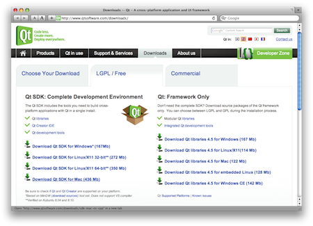
Qt is an interface toolkit and application framework. The current version of LPub requires Qt 4.5. I downloaded the LGPL/Free version of the Qt SDK for Mac (436 Mb). Installation is easy: just double-click the installer package and accept the default settings.
Download the LPub Code
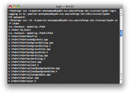
Fire up Terminal and navigate to an appropriate place to store your files (probably not the Desktop). Check out a fresh copy of the LPub source code with the following two commands (just press enter when prompted for a password):
cvs -d:pserver:anonymous@lpub4.cvs.sourceforge.net:/cvsroot/lpub4 login
cvs -z3 -d:pserver:anonymous@lpub4.cvs.sourceforge.net:/cvsroot/lpub4 co -P LPub4
This will result in an LPub4 folder containing everything you need. To update your working copy of the code with any recent changes, issue the following command from anywhere within the LPub4 folder:
cvs update
Compile LPub
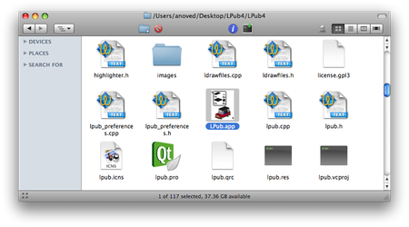
Navigate to the innermost LPub4 directory, create a Makefile for your machine, and compile the program with the following commands:
cd LPub4/LPub4
/usr/bin/qmake -spec /usr/local/Qt4.5/mkspecs/macx-g++ -macx -o Makefile LPub.pro
make
After updating from previous versions of LPub, you may occasionally find it necessary to delete the com.lpub.LDraw Building Instruction Tool.plist file from your ~/Library/Preferences directory.
Test and Provide Feedback
Now you’re ready to experiment with the latest LPub technology. Make some custom instructions! (Explaining the ins and outs of the program itself is a subject for another post.)
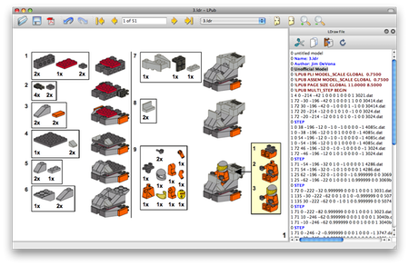
Your work is not done yet, though: an important part of playing with unreleased software, in my opinion, is to provide feedback to the developer (even if you are not a programmer, your input can be very useful). Offer detailed descriptions of any bugs you encounter, cogent suggestions for improvements, and thanks to folks like Kevin for investing so much effort in programs like LPub.
Posted on Saturday, May 16th, 2009. Tags: LDraw, LEGO, lpub.
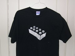
My LEGO Shirt
I made a stencil of the basic LEGO brick and spray-painted it on a T-shirt. It’s pretty rad.
Posted on Thursday, May 7th, 2009. Tags: LEGO.
Learning Statistics by Implemetation
Over the coming summer months, I’ll be writing code to implement a variety of tests of significance. I have a modicum of statistical literacy, but I don’t have the expertise to recognize which tests are appropriate for particular problems. Rather than just learn which buttons to click in SPSS, I want to understand each common test from the inside out. Teaching a subject is a great way to learn about it, so I plan to teach the dumbest pupil of all – the unimaginative computer. I’ll post my progress here.
Posted on Thursday, May 7th, 2009. Tags: math.
From Where She Stood
My sister’s semester animation project is complete. This has been many late nights in the making.
Great work, Rach!
Posted on Wednesday, May 6th, 2009. Tags: art.
The Easy Reader
What a great idea. Via Boing Boing, a chair that is a bookshelf and a wheelbarrow. It is designed by Nils Holger Moormann.
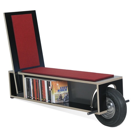
This goes on my list of things to build.
Posted on Monday, May 4th, 2009.
Ladies
Drawn wrong handed:
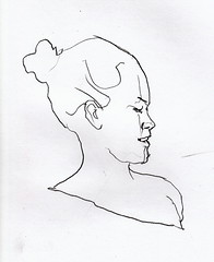
Black and white are my favorite colors:

Posted on Monday, November 24th, 2008. Tags: art.