Cartograms
A cartogram is a map in which the area of each region is distorted to represent a value other than physical area, such as population.
It’s election season here in the US, which means we see many maps of red and blue states. To keep the political persuasion of the nation in perspective, take a look at Michael Gastner, Cosma Shalizi, and Mark Newman’s maps of the 2004 and 2006 elections.
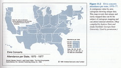
One of my favorite web sites, Strange Maps, has occasionally featured cartograms, including a map of world population from another collection of global cartograms prepared by Newman.
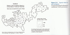
Strange Maps also featured a cartogram of where news happens drawn from a seminal paper by Gastner and Newman. The paper presents a solution to the challenge of preserving recognizable shapes and adjacencies while manipulating area. Traditional techniques typically compromise contiguity or detail, as seen in these examples from Borden Dent’s excellent Cartography: Thematic Map Design:
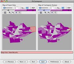
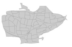
Conveniently, various implementations of Gastner and Newman’s algorithm are available: cart, by Newman; cartogram, by Gastner; and Cartogram Generator, by Frank Hardisty. Hardisty’s program has a cross-platform interface and works directly with shapefiles and shapefile attributes. I used it to create a cartogram of block groups in Binghamton based on their year 2000 populations:
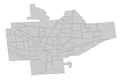
The distortion is not extreme, but there are some interesting changes.
In addition to the interactive comparison view shown above, Cartogram Generator allows you to save the results as a new shapefile. It is supposed to have the ability to apply the same transformation to other shapefiles, too – useful for creating reference layers – but I could not get that feature to work.
I think it is important to show an undistorted map next to a cartogram except in cases where the actual sizes are well known (as with maps of the world or your state or nation). Otherwise, changes in proportion might not be recognized, and the story they are meant to tell will not be heard.
Posted on Saturday, October 4th, 2008. Tags: geography.
3 Responses to “Cartograms”
Posted by Lars on Sunday, October 5th, 2008 at 8:34 PM.
Interesting final point about needing to show the original, un-diffused map alongside the cartogram for comparison.
There is a degree to which you can (kinda) tell how a cartogram is distorted relative to the original map, depending on how rectilinear the parts are and how familiar the map is to the audience. Maybe a small (e.g. inset) map would serve as a good reference.
Posted by Jim on Monday, October 6th, 2008 at 9:58 AM.
I think an inset map would work nicely for that purpose.
Non-contiguous cartograms are definitely useful. Upon further reflection and experimentation, I see that maintaining each border can lead to excessive distortion. Sometimes the purpose of a cartogram is better served by sacrificing topological accuracy to preserve the known shape of each area.
Here’s an example – the map of New York is unrecognizable due to the distortion necessary to maintain contiguity among the inflated metropolitan counties.
When do you think the “Gaster-Newman” algorithm is most appropriate? I was excited to find software for it (which I think you’ve described in more detail), but I realize it is just one method among many. The compromises I mentioned in some cartograms can be advantageous.
Posted by Jim on Friday, November 7th, 2008 at 8:19 PM.
Andy Woodruff of Axis Maps raises some valid concerns about the usability of cartograms (especially those that preserve topology at the expense of recognizable shapes).