Tag Archive: “javascript”
Reigning in Readability’s Multi-Page Stitching
Readability’s new multi-page integration feature is great for reading articles that are split into a few pages. However, in some cases I still prefer not to load any additional pages of text. For instance, online ePub readers such as Bookworm, the open source predecessor to Ibis Reader, present one book chapter per page. The chapters are sequentially linked in a way recognized by Readability, so an entire novel could be loaded and displayed if you invoke Readability to view one chapter!
As it turns out, an internal maxPages variable limits how many pages Readability will load. By default, it is set to 30. However, as I suggest, a small addition to the main Readability script will allow this limit to be set by the user via an extra bookmarklet parameter.
If you want to experiment with this yourself, you can modify your Readability (or McReadability) bookmarklet such that _readability_script.src points to the following copy of the script: http://anoved.net/js/readability.js (I’m not going to provide an easy link because I’m wary of using up too much of my low-rent bandwidth). Also add readMaxPages to the list of parameters in your bookmarklet; use readMaxPages=1; to prevent loading any text not on the current page (a link to the next page found, if any, will still be appended).
Posted on Sunday, September 26th, 2010. Tags: code, javascript, readability.
McReadability
Readability is a simple tool that makes reading on the Web more enjoyable by removing the clutter around what you’re reading. McReadability (“Multi-column Readability”) is a new stylesheet for Readability that formats the text in constant-height columns arranged side-by-side. It works best with lengthy texts.
For more screenshots and information, view these previous posts.
McReadability is now hosted at GitHub! Set up your bookmarklet here: anoved.github.io/mcreadability
Posted on Monday, June 14th, 2010. Tags: code, css, javascript, readability.
Multicolumn Readability Preview
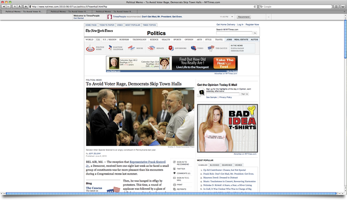
Here’s an article from the New York Times as it appears on my 1920 × 1080 display. There are lots of distractions, but only about one and a half paragraphs of article text are visible.
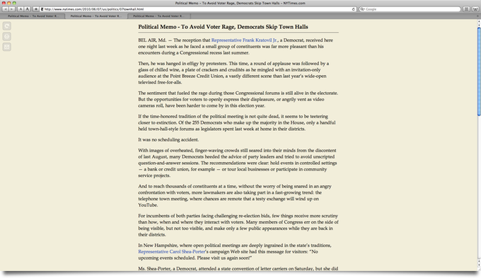
Here’s how it looks with Readability, a great bookmarklet that filters out the crap and presents the content in a simple, elegant, format:
I created an alternate stylesheet for Readability that formats the text in multiple columns, newspaper-style. (NEW! Compare to Safari Reader.) You scroll sideways; in this format, it’s easier to consult more of the article without scrolling.
This modification was inspired by a desktop app called Tofu.
Compatibility
All Readability configuration options are supported, including footnote links. Margin width is interpreted as the inverse of column width (wide margins yield narrow columns). Some column width tweaking and cross browser debugging remains to be done. I know it works in Webkit and Mozilla (Safari and Firefox); implemented with CSS3 Columns.
That’s hot, Jim. I want it.
First I want to check if it’s feasible or worthwhile to submit it as a patch to the original bookmarklet, although there are valid concerns that the column format isn’t appropriate for all types of content that may be viewed with Readability.
Otherwise, I’ll definitely make it available here – although I’ll have to investigate what’s permissible. (I have difficulty understanding the terms of many open source software licenses.) Fortunately, since all my changes are confined to the stylesheet, a normal Readability bookmarklet can be edited to point to a copy of the multi column stylesheet.
Update: Now available.
Posted on Monday, June 7th, 2010. Tags: code, css, javascript, mac, readability, safari.


