LSynth 3.1 for Mac OS X
I have compiled a Mac OS X version of LSynth 3.1, the recently released update to the program that synthesizes LDraw code for flexible LEGO parts.
Download LSynth 3.1 for Mac OS X 10.5+ (Universal Binary; 85 KB)
This download includes the lsynthcp executable as well as the configuration file (.zip) and the constraint parts (.zip) available at Willy Tschager’s installation tutorial page for MLCad users (which contains some useful information for all LSynth users).
Important Compatibility Note: The executable in the above download may only work with Mac OS X 10.5 (Leopard) or greater. Click here to download a version of lsynthcp that should also be compatible with Mac OS X 10.4 (Tiger), provided by current LSynth developer Don Heyse. Thanks, Don!
Installation
Copy the LSynth constraint parts to the parts/ or Unofficial/parts/ directory of your LDraw part library. Keep the lsynth.mpd configuration file in the same directory as the lsynthcp executable. LSynth is not integrated with Bricksmith, so you can keep these files wherever you prefer. You will need to use the command line to run LSynth.
Usage
To use LSynth, you manually place constraint parts at key locations such as the endpoints of a hose. Then you input the LDraw file to lsynthcp, which generates a duplicate file containing all the hose segments, chain links, etc. necessary to represent the flexible part described by the constraints.
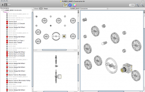
For example, here is the RUBBER_BAND-Constraints.ldr file from Willy’s excellent page of LSynth examples:
With the file in same directory as lsynthcp and lsynth.mpd, run the following command:
./lsynthcp RUBBER_BAND-Constraints.ldr Rubber_band_output.ldr
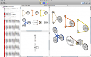
Here is the output:
For more detailed information about using LSynth, peruse Willy’s troubleshooting page and the pages linked above.
Notes
Here are the minor modifications I made to compile the LSynth 3.1 source package for Mac OS X:
- Edit the comment on Line 69 of
lsynthcp.cto begin with slashes (//) instead of backslashes (\\). - Append “
-arch i386 -arch ppc” to lines 3 and 17 ofmakefileto enable Universal Binary support.
The make command is sufficient to compile the program.
This release supersedes the LSynth Service I made a few years ago.
Posted on Saturday, November 21st, 2009. Tags: bricksmith, LDraw, LEGO, mac.
Drawings
I’ve been cranking them out for NaNoDrawMo.
Here are some other favorites:
Plenty of profile drawings of pretty faces. What next?
Posted on Monday, November 9th, 2009. Tags: art.
NaNoDrawMo 2009
NaNoDrawMo is a drawing challenge started by Steven Frank of Panic software. Inspired by NaNoWriMo’s 50000-word target, the objective is to do 50 fifty drawings in November (a picture is worth a thousand words, so fifty pictures…). My contributions will be visible here.
I’ve started off in familiar territory, but I hope to experiment with different styles over the course of the month.
Posted on Monday, November 2nd, 2009. Tags: art.
Using QuickCursor with TextWrangler
Via Michael Tsai’s blog: QuickCursor is a new utility that let’s you use the text editor of your choice to edit text fields you encounter in any program. It supports BBEdit by default, but it’s not too hard to add support for BBEdit’s little brother TextWrangler. Here’s how:
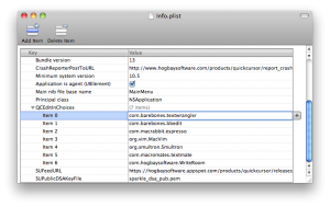
Open QuickCursor.app/Contents/Frameworks/Info.plist with Property List Editor, display the QCEditInChoices array, and click Add Child. Enter com.barebones.textwrangler and save the file.
Now you can use TextWrangler almost anywhere.
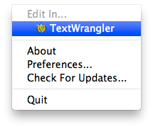
Of course, it’s not too hard to cut and paste text to and from another editor. This is most useful if you define a shortcut key to open the current text field in your favorite editor.
Posted on Monday, October 5th, 2009. Tags: mac, textwrangler.
In which I present alternate model building aptitude as a marketable career skill
From the NYT article on Lego’s business recovery:
The changes [that optimized the company’s supply chain] also filtered down to the ranks of Lego’s toy designers, says Paal Smith-Meyer, head of Lego’s new-business group. The number of different bricks or elements that go into Lego toys has shrunk to less than 7,000 from roughly 13,000, and designers are encouraged to reuse parts, so that a piece of an X-wing fighter from the “Star Wars” series might end up in Indiana Jones’s jeep or a pirate ship.
There’s an emphasis on the creative reuse of limited parts in the design of current Lego sets. Someone who demonstrably makes that specific challenge the focus of their hobby would be an asset to the company.
Posted on Sunday, September 6th, 2009. Tags: LEGO.
Transportation Alternatives
A post at The World Awheel suggests we should compare bicycles to the foot rather than the car. From that perspective, the around-town advantages seem unambiguous. The ability to travel faster than you can by walking, combined with the ability to navigate beyond the domain of public transit, is a great ability indeed — especially if the operating costs are next to nothing.
In fact, there are a lot of people, most of them hidden from those of us in a comfortably middle-class position, who are not a part of America’s car culture because they simply can’t own a car. These are the people we need to get on bicycles, because for them, for all intents and purposes, it’s still 1881.
There is more to solving transportation problems than providing an affordable vehicle for everyone, of course. Transportation needs are irrevocably related to the structure of our society. Where do you go, how do you get there, and what are the costs?
Posted on Wednesday, September 2nd, 2009. Tags: bike, car.
FileMaker Pro 10 Rulers
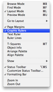
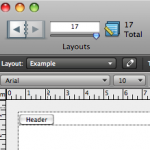
A quick tip for FileMaker Pro 10 users: in Layout mode, you can choose to display Graphic Rulers from the View menu:
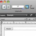
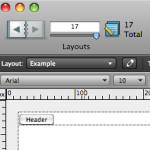
What you may not realize is that you can easily toggle between ruler units by clicking the unit label that appears in the upper left corner of the rulers. Unit options include in (inches), cm (centimeters), and px (pixels):
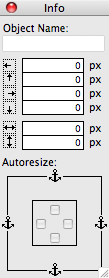
You can also toggle units by clicking the unit labels in the Info palette:
Posted on Wednesday, September 2nd, 2009. Tags: filemaker, mac.
Bookmark in Yojimbo compatible with Yojimbo 2.0
The current version of my Bookmark in Yojimbo script is compatible with the recently-released Yojimbo 2.0.
Posted on Wednesday, September 2nd, 2009. Tags: applescript, mac, safari, yojimbo.
Expanded Comments Fields for Yojimbo 2.0
Bare Bones Software has released Yojimbo 2.0, which I heartily recommend. However, Yojimbo 2.0 still comes out of the box with fixed-height comment fields. Here is an updated version of my hack to display comment fields that expand to fill the available space:
Download Expanded Comments Fields for Yojimbo 2.0 (32k)
Posted on Wednesday, September 2nd, 2009. Tags: mac, yojimbo.
Neighbors Mapping Neighborhoods
The big outcome of our initial presentation of BNP data was the development and administration of a survey to assess general social attitudes and specific attitudes towards certain city initiatives among residents of a certain area in the city. The survey was intended to inform groups involved in that initiative, but it also complements existing data and the lead author’s research interests.
Of particular interest to me was the opportunity to tag some map-based questions onto the survey. We provided a street map (courtesy of the Goog’s cartography gnomes), and we asked respondents to highlight the streets that comprise their neighborhood. Here’s what it looks like:
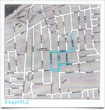
This example is representative of the scope and detail of actual responses, but it is not an actual response. No individual responses have been (or will be) divulged!
In survey parlance, this is a “pilot instrument” in at least two regards. Firstly, we were uncertain how readily respondents would understand what they were being asked to do. Secondly, we were uncertain what the best way to analyze the responses would be.
The first concern has proven to be a non-issue. Drawing on a map is fun; I think people found it the most engaging part of the survey. Furthermore, they tend to reason aloud about what makes up their neighborhood as they mark their stomping grounds. These narratives are interesting.
(Yes, I participated in the door-to-door administration of the survey. It was a fascinating experience which deserves further elaboration.)
The second concern, processing the responses, has yet to be fully addressed. The initial plan was to scan and digitize each map for exploratory GIS analysis. What has actually happened to date is that we’ve numbered each major street segment in the neighborhood, and coded each hand-drawn map according to which street segments it includes. This data will inform a statistical social network analysis of the neighborhood.
Anyway, the survey — of the neighborhood surrounding Mary Street and the straw bale house that will be built there — has generated quite a bit of interest. So far we’ve presented the results three times (to the Binghamton Housing Authority’s South Side Alive committee, to the Mayor’s office, and just today to the South Side West neighborhood assembly); a quantitative approach to neighborhood planning and assessment seems surprisingly novel and interesting to residents and officials alike.
Posted on Tuesday, September 1st, 2009. Tags: geography.
