McReadability compared to Safari Reader
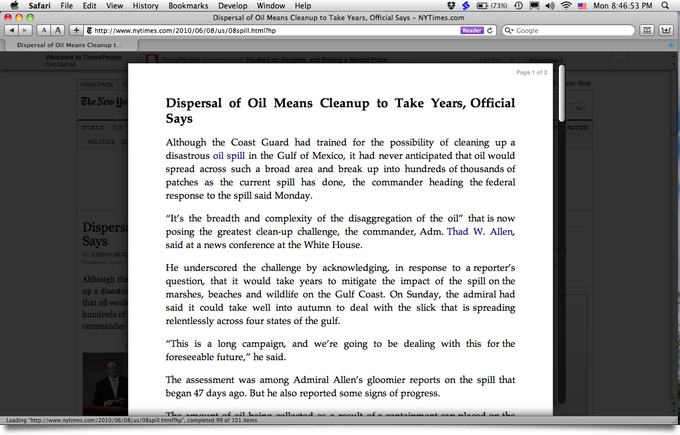
Timely follow-up to yesterday’s multi-colum readability teaser: today, among other announcements, Apple released Safari 5, which includes a built-in Reader feature very similar to Readability. (Update: as Prashant Vaibhav points out in the comments on the Arc90 blog, Safari Reader is in part based on Readability.) Here’s what it looks like:
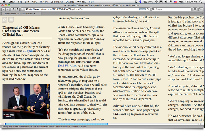
Swanky. I like some aspects of this reader, but I’m not crazy about the fully justified text. Here’s what the same article looks in McReadability:
Which layout you prefer is, of course, a matter of taste. My stylesheet scales down images, if necessary, to fit the column width. Tofu was my inspiration for McReadability. Here is the Amar Sagoo’s argument in favor of the multi-column format (Amar created Tofu):
Text is usually very wide on the screen, which makes going from the end of one line to the beginning of the next difficult. That’s why newspapers have narrow columns: It makes them faster to read.
So why not just take a normal window and make it narrower, scrolling down as you need? Well, there are usually a lot of lines in a text, and all look more or less the same, so if they move past your eyes vertically, they are difficult to keep track of. The text doesn’t feel stable, and you get lost easily.
Posted on Monday, June 7th, 2010. Tags: code, mac, readability, safari.


3 Responses to “McReadability compared to Safari Reader”
Posted by Nathaniel on Friday, July 23rd, 2010 at 2:56 PM.
Thanks for creating a proper Tofu-inspired Readability bookmarklet for the web. However, I think you should add an option for justified text if that’s possible, like in Tofu. Obviously, everyone has different reactions to layout, but I found that justified columns were far easier to keep track of while reading.
Thanks again!
Posted by Jim on Friday, July 23rd, 2010 at 5:47 PM.
Hi Nathaniel,
Glad you like it. I made an alternate version of the stylesheet with justification (since McReadability still uses normal Readability’s page-cleaning code, not sure if it’s possible to add a new option otherwise). Anyway, if you replace http://anoved.net/css/mcreadability.css with http://anoved.net/css/mcreadability-justify.css in the McReadability bookmarklet code, you should get what you’re after.
Posted by Nathaniel on Friday, July 23rd, 2010 at 6:45 PM.
Thanks! Works great.