Tag Archive: “geography”
Beginning Processing
Processing is a system that makes it as straightforward as possible to do some pretty sophisticated graphics programming. Based on Java, it abstracts enough technical details to let you focus, more or less, on the basic logic of the idea you want to animate. From the web site:
It is used by students, artists, designers, researchers, and hobbyists for learning, prototyping, and production. It is created to teach fundamentals of computer programming within a visual context and to serve as a software sketchbook and professional production tool.
Check out the Exhibition for some examples of what’s possible and the Tutorials to see how easy it is get started. There is a great collection of examples for specific topics, too, most of which include illustrative applets embedded in the page. The ability to export Processing programs (or “sketches”) as applets is particularly appealing, although my understanding is that some features, such as file I/O, are available only in application or development mode. It works cross-platform.
I know I have encountered Processing before, but my current interest began as I read Andy Lynch’s description of a simple LDraw renderer he implemented as a Processing sketch. That lit a fire under some related ideas of my own that have been simmering for want of an optimal outlet.
But there’s more to my interest than digital bricks: if there isn’t already a decent library (which would be surprising, as many useful libraries seem to be available), I might be tempted to write a shapefile loader, if for no other reason than to complement the shapefile parser I once wrote for Chipmunk Basic. I think it could be fun to experiment with some raster GIS and remote sensing ideas in Processing, too. (Just get the spectral signatures – click, click, click – and you do it. That’s all what it is!) Last but not least, per its original intent, I can envision using Processing as a superior tool to visualize certain data.
What sort of Process will you invent?
Posted on Monday, January 11th, 2010.
Neighbors Mapping Neighborhoods
The big outcome of our initial presentation of BNP data was the development and administration of a survey to assess general social attitudes and specific attitudes towards certain city initiatives among residents of a certain area in the city. The survey was intended to inform groups involved in that initiative, but it also complements existing data and the lead author’s research interests.
Of particular interest to me was the opportunity to tag some map-based questions onto the survey. We provided a street map (courtesy of the Goog’s cartography gnomes), and we asked respondents to highlight the streets that comprise their neighborhood. Here’s what it looks like:

This example is representative of the scope and detail of actual responses, but it is not an actual response. No individual responses have been (or will be) divulged!
In survey parlance, this is a “pilot instrument” in at least two regards. Firstly, we were uncertain how readily respondents would understand what they were being asked to do. Secondly, we were uncertain what the best way to analyze the responses would be.
The first concern has proven to be a non-issue. Drawing on a map is fun; I think people found it the most engaging part of the survey. Furthermore, they tend to reason aloud about what makes up their neighborhood as they mark their stomping grounds. These narratives are interesting.
(Yes, I participated in the door-to-door administration of the survey. It was a fascinating experience which deserves further elaboration.)
The second concern, processing the responses, has yet to be fully addressed. The initial plan was to scan and digitize each map for exploratory GIS analysis. What has actually happened to date is that we’ve numbered each major street segment in the neighborhood, and coded each hand-drawn map according to which street segments it includes. This data will inform a statistical social network analysis of the neighborhood.
Anyway, the survey — of the neighborhood surrounding Mary Street and the straw bale house that will be built there — has generated quite a bit of interest. So far we’ve presented the results three times (to the Binghamton Housing Authority’s South Side Alive committee, to the Mayor’s office, and just today to the South Side West neighborhood assembly); a quantitative approach to neighborhood planning and assessment seems surprisingly novel and interesting to residents and officials alike.
Posted on Tuesday, September 1st, 2009.
Map Layout with QGIS
I haven’t tried using Quantum GIS in a few years, but Frank Donnelly has posted a thorough review of a thematic map he created with the current version of QGIS (1.02). By all indications, the program has progressed considerably since the last time I tried it. This is good news because it means free software is becoming a viable alternative for many thematic mapping tasks:
Despite a few quirks (what software doesn’t have them), I was really happy with the end result and find myself using QGIS more and more for making basic to intermediate maps at work. Not only was the print composer good, but I was also able to complete all of the pre-processing steps using QGIS or another open source tool.
Frank’s review of map elements reminds me of my own introductory cartography course. Incidentally, my TA had a petulant fetish for grotesque north arrows. Anyway, it’s nice to see New York dressed up in some fancy duds (compared to the county boundaries with which I’m most familiar, of course).
Posted on Sunday, July 12th, 2009.
Neighborhood Quality
Although I will be unable to participate in the presentation I alluded to last week, I am happy to report it proved quite feasible to prepare a package of example data in Google Earth format. I have provided a single self-contained KMZ file to my colleagues. It contains a variety of map overlays organized in folders, including labels and some descriptive annotations.

Neighborhood quality as perceived by resident students.
The interpolated surface in the screenshot above depicts the results of a survey assessing middle and high school student perceptions of neighborhood quality. My house lies just inside a hot spot. I look forward to plotting the results of the most recent edition of this survey. We’ll test the landlady’s opinion about neighborhood decline!
Posted on Tuesday, June 23rd, 2009.
Rudimentary Legends
In yesterday’s experiment with choropleth maps in Google Earth, I acknowledged the lack of classification legend. I used the Layer to KML conversion tool in that example, but today I tried the Map to KML tool. It includes certain map layout objects like legends.

Rudimentary legend generated by Map to KML conversion tool.
I don’t care for the way it looks, and it certainly needs clearer labels, but it’s a legend. The legend won’t appear in Google Earth if it was converted to graphics in ArcMap, so keep in mind that Map to KML will only preserve some elements.
Posted on Friday, June 19th, 2009.
Popular Reference
Yesterday I was thinking about how to make maps more accessible by adding reference features to the display. Today I realized that since Google Earth is such an excellent reference tool – replete with imagery, street maps, and the captivating advantage of seamless navigation – the problem of anchoring the data might be resolved by presenting it in that context. As a trial, I used the ArcToolbox Layer to KML conversion tool to save some maps in a compatible format.

Sample choropleth map viewed in Google Earth.
I think this is a useful way to lead a discussion about a place. We can present our data, yet easily and actively explore other aspects of the environment. A playful approach is engaging, and can have serious benefits: it is important to ask questions like “is this the right data?” or “what else is going on here?”. I feel this exploratory attitude is appropriate in my situation; when I present our data, I want to inspire the group to think about possible applications and variations.
The sample map pictured above is faulty in that no legend is displayed. I think it is possible to include a legend, among other things, in the KML file. I look forward to getting up to speed on Google Earth & Maps technology. I expect that in the future more Binghamton Neighborhood Project data will be made available online in this way; Google even encourages projects like ours through Outreach.
Here I advocate using Google Earth as a venue for presenting conventional choropleth maps because of the ease with which other reference layers can be explored, providing context for the data. I agree with Mark Harrower that three dimensional thematic maps (porcupine globes) are generally unsuccessful, but the debate is interesting, so check out the relevant posts by Bjørn, Leszek, and Rich.
Rich concludes with some points that reflect my own reasons for enthusiasm about this approach. In particular, he gives this example:
Draping a thematic map over topography can be a useful visualisation e.g. polygons showing erosion rate draped over a range of mountains, by eye you could then relate erosion to slope.
The sample map shown above happens to be “Percent Tree Cover” by census block. With Google Earth’s Terrain layer enabled, it soon becomes evident that the hilltops are the most heavily forested areas around the city. I am curious what other neighborhood relationships the group will uncover when we explore our demographic data!
Posted on Thursday, June 18th, 2009.
Reference Features
Next week I will help present some Binghamton Neighborhood Project data to a small committee of people interested in the state of our city’s South Side. I will be showing maps of various demographic measures collected by the BNP, addressing the question “who are the residents of the South Side?” and demonstrating the project’s ability to develop knowledge about neighborhoods.

Binghamton's South Side as viewed from Google Earth.
Today I have been thinking about how to present these maps. Spatially, the lowest common denominator for our data is the census block group. I will use census block groups as the enumeration unit for my thematic maps.
However, in this case I don’t think it is sufficient to just plot the data. Few people are familiar with census geography – you may recognize the shape of your nation or state, but do you recognize the shape of your census tract or block group?

U.S. states are easily recognized.
If the purpose of a map is to complement the viewer’s knowledge of an area, it is the map’s function – and the cartographer’s responsibility – to link the data to the viewer’s conception of the place. If the enumeration units are easily recognized – states, counties, etc. – then no further context is needed. If the data is organized at an unfamiliar resolution, additional reference features are needed to root the map in the viewer’s world.

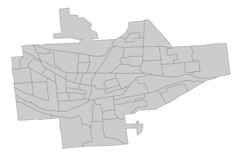
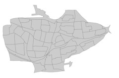
Binghamton block groups are not so familiar, even to local residents.
Reference features can be streets, labelled landmarks, or natural features. Boundaries of more familiar regions can be informative, too, but if the region of interest is small and falls entirely within well-known borders, physical features remain the best reference. Especially pertinent are those features people encounter in their daily activities.
I think this sort of context has been absent in previous presentations of BNP data. The project has generated plenty of interest in the community, but little sustained engagement. I suspect the idea seems inspiring, but the information bewildering; it’s hard to act or base decisions on seemingly arbitrary patterns.
Our goal is not to share what we know about block groups (or any other artifact of data collection), but to share what we know about neighborhoods – places associated with homes, schools, businesses, and the routes we navigate. So, I will try to make meaningful maps by integrating our information with some of these well-known elements.
Posted on Wednesday, June 17th, 2009.
Cartograms
A cartogram is a map in which the area of each region is distorted to represent a value other than physical area, such as population.
It’s election season here in the US, which means we see many maps of red and blue states. To keep the political persuasion of the nation in perspective, take a look at Michael Gastner, Cosma Shalizi, and Mark Newman’s maps of the 2004 and 2006 elections.
One of my favorite web sites, Strange Maps, has occasionally featured cartograms, including a map of world population from another collection of global cartograms prepared by Newman.
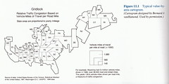
Strange Maps also featured a cartogram of where news happens drawn from a seminal paper by Gastner and Newman. The paper presents a solution to the challenge of preserving recognizable shapes and adjacencies while manipulating area. Traditional techniques typically compromise contiguity or detail, as seen in these examples from Borden Dent’s excellent Cartography: Thematic Map Design:
Conveniently, various implementations of Gastner and Newman’s algorithm are available: cart, by Newman; cartogram, by Gastner; and Cartogram Generator, by Frank Hardisty. Hardisty’s program has a cross-platform interface and works directly with shapefiles and shapefile attributes. I used it to create a cartogram of block groups in Binghamton based on their year 2000 populations:
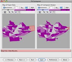
The distortion is not extreme, but there are some interesting changes.
In addition to the interactive comparison view shown above, Cartogram Generator allows you to save the results as a new shapefile. It is supposed to have the ability to apply the same transformation to other shapefiles, too – useful for creating reference layers – but I could not get that feature to work.
I think it is important to show an undistorted map next to a cartogram except in cases where the actual sizes are well known (as with maps of the world or your state or nation). Otherwise, changes in proportion might not be recognized, and the story they are meant to tell will not be heard.
Posted on Saturday, October 4th, 2008.
PROJ, GDAL, and OGR – Oh, My!
Here are brief introductions and home-brew installation instructions for two libraries (and sets of command line tools) widely used by open-source GIS applications.
In most cases you probably won’t need to compile these yourself, as end-user programs are typically packaged with everything you need. Sometimes batteries aren’t included, though, or you might want to write a program that uses these tools directly. They’re like wheels you don’t need to reinvent to build construction vehicles for your novel GIS problems.
proj-4.6.1: PROJ.4 Cartographic Projections Library
From the documentation (OF90-284):
Program proj (release 3) is a standard Unix filter function which converts geographic longitude and latitude coordinates into cartesian coordinates, (λ, φ) → (x, y), by means of a wide variety of cartographic projection functions.
Cartographic projection is the process by which points on a sphere are mapped to points on a plane. There are many ways this can be accomplished, all of which are necessarily compromises. PROJ.4 provides a programming interface to perform such projections.
./configuremakemake install
gdal-1.5.2: Geospatial Data Abstraction Library
GDAL provides a common programming interface to translate and access a variety of geospatial raster (i.e. bitmap) data formats. GDAL includes the OGR Simple Features Library, which performs a similar function for vector data. OGR uses PROJ.4.
./configuremakemake install
GDAL’s configure script reports which optional features are available. Many have additional dependencies, such as the TIFF and PNG libraries built in a previous guide.
Posted on Monday, September 22nd, 2008.
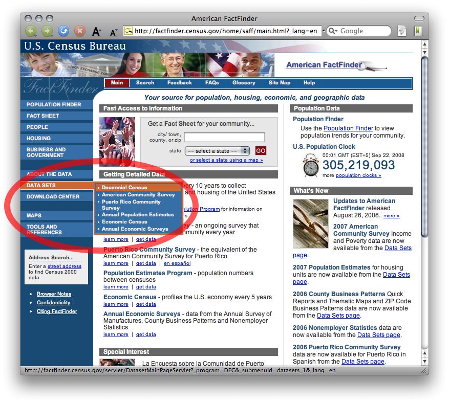
American FactFinder: Geo within Geo
A great deal of census data is available through American FactFinder. The custom table interface allows you to retrieve a single table containing exactly the data you want. To obtain data for many locations within another location, use the easily-overlooked “geo within geo” selection method to avoid the tedium of retrieving and combining separate tables for a group of locations.
As an example, I’ll show you how to retrieve the year 2000 population by age and sex for each block in Broome County, NY.
First, select Decennial Census from the Data Sets menu at factfinder.census.gov:
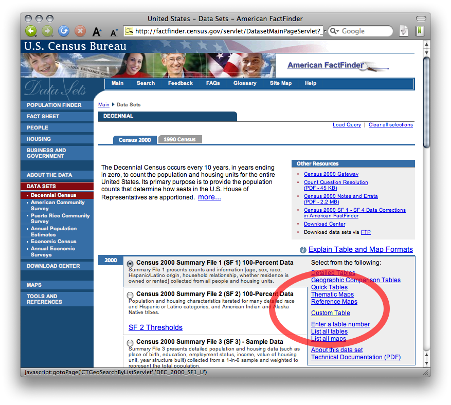
Then select Custom Table from the Census 2000 Summary File 1 category:
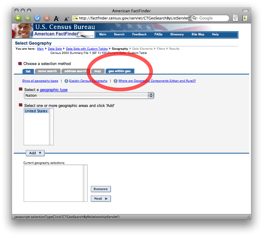
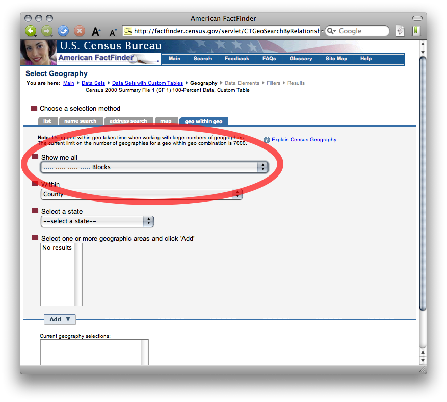
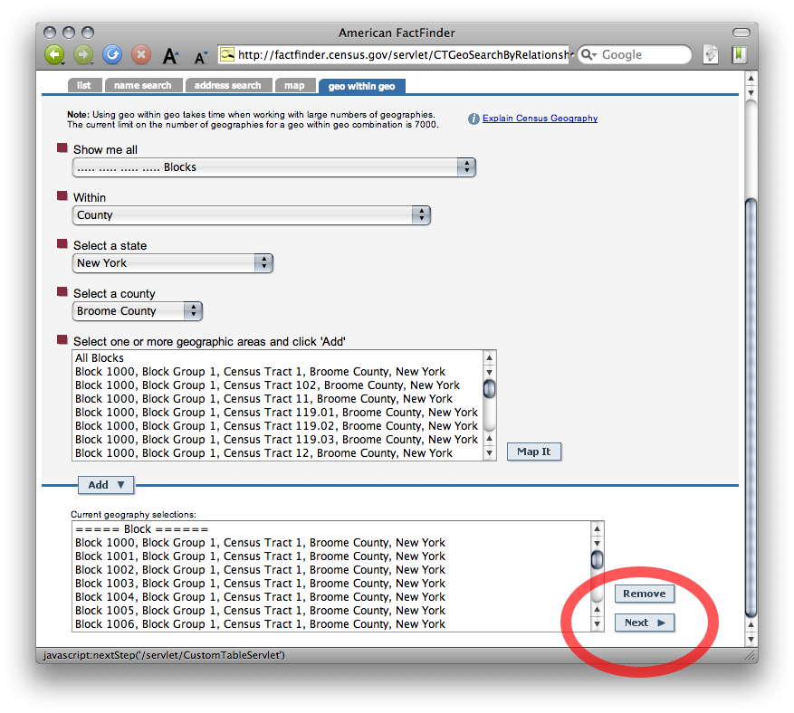
Here’s the important step. Click the geo within geo selection method tab:
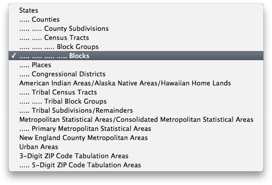
Choose Blocks from the Show me all menu (your table will contain data at this resolution):
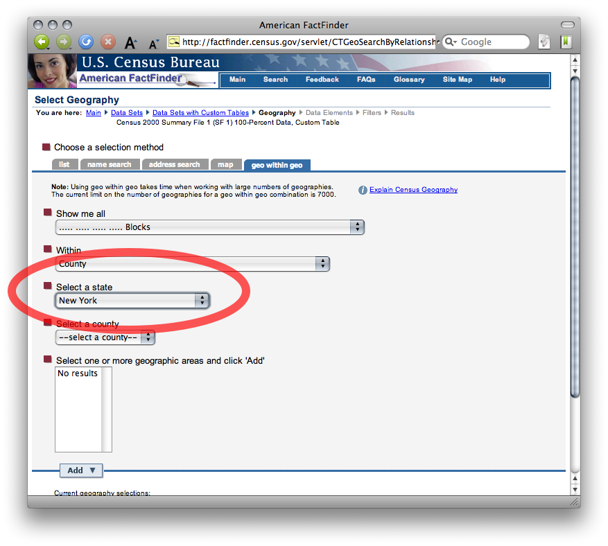
By default, the table will contain all block groups within a county. Select New York and Broome County from the following menus to select which county:

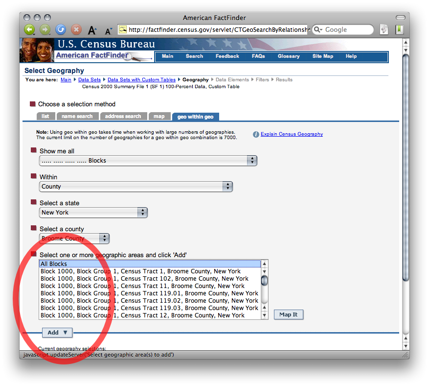
Select All Blocks from the list of blocks in Broome County and click Add:
Now that you have defined the enumeration units and area of interest, click Next to choose your variables:
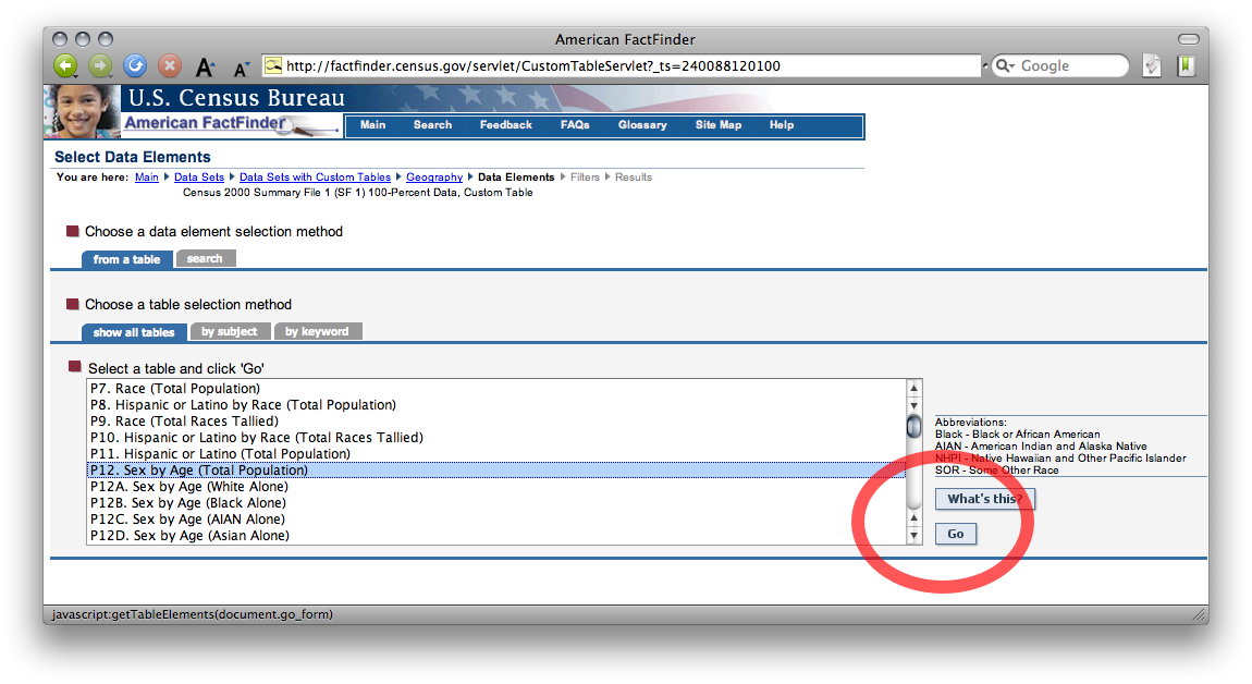
Select P12 Sex by Age (Total Population) from the list of tables in Summary File 1 and click Go:
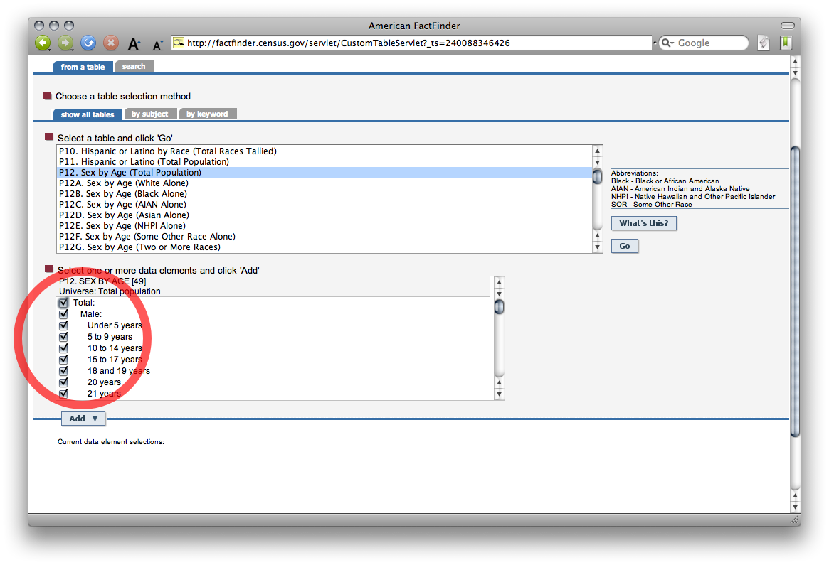
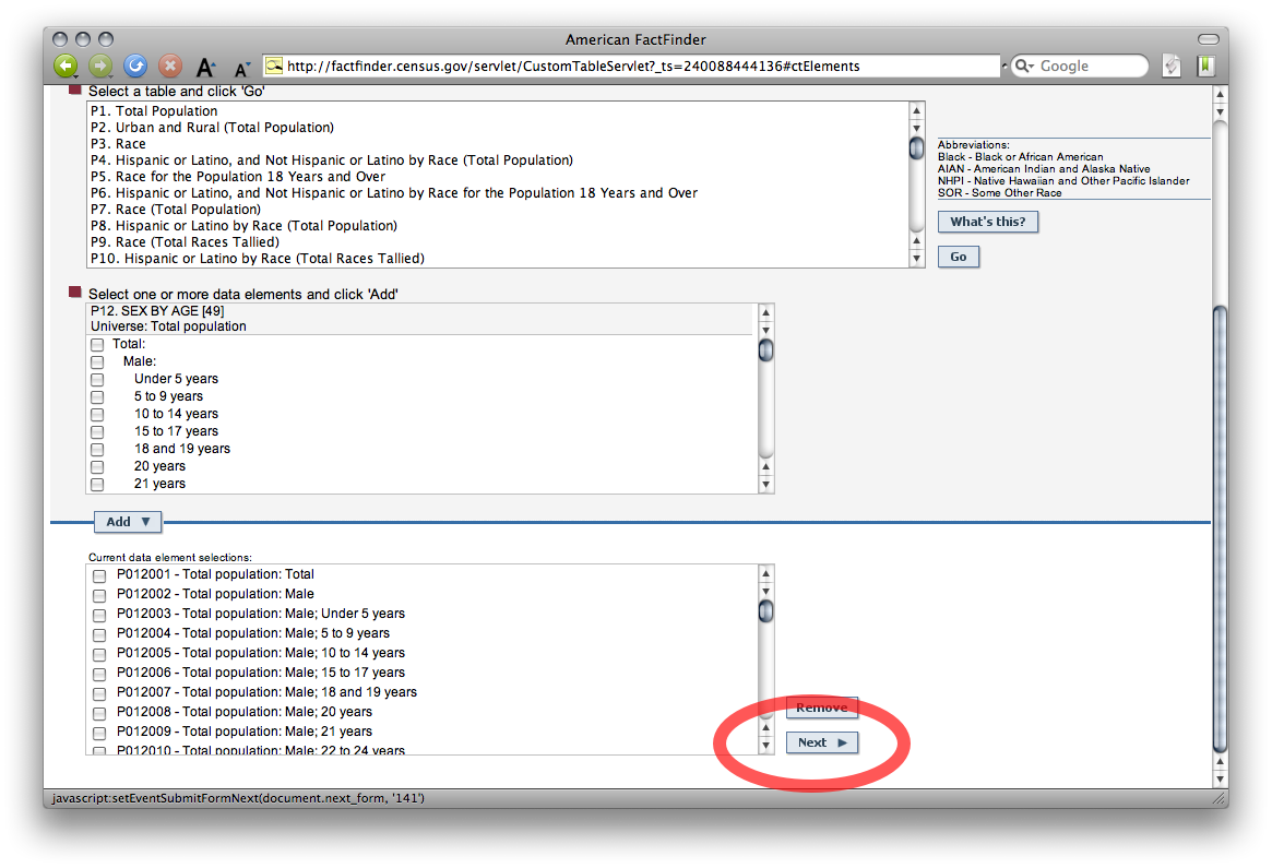
Check which variables you want from table P12 – all of them. Click Add, then click Next to proceed:
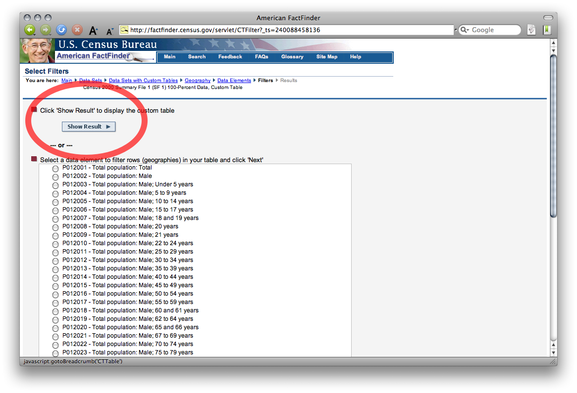
Click Show Result to display the table (this may take a few moments):
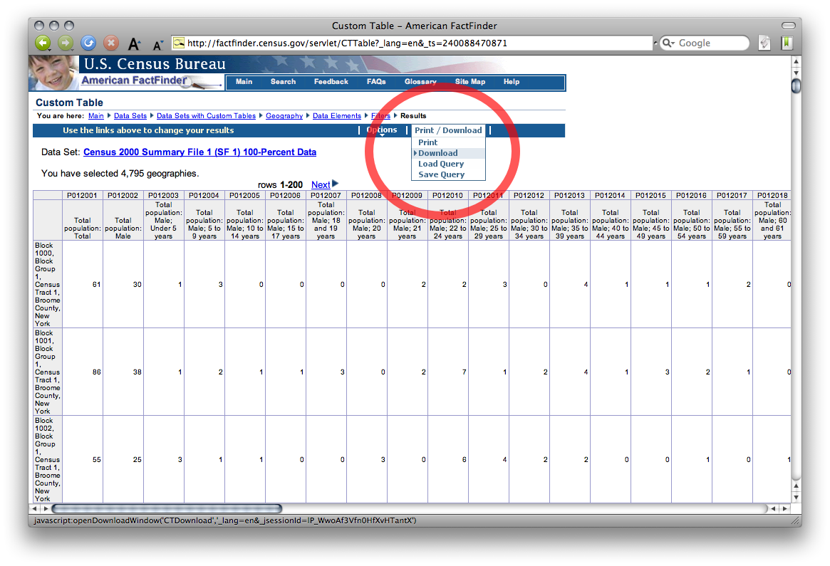
Lastly, choose Download from the Print/Download menu to obtain the table in spreadsheet form:
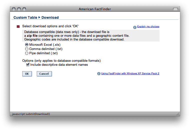
How you use the data is up to you. Perhaps you’ll use dbfjoin to map it with an appropriate shapefile from the Census Bureau’s TIGER/Line repository. (Users of pro GIS tools don’t need dbfjoin, but I’m bringin’ it to the streets!) Alternatively, you might want to plot the age/sex composition of a few blocks with Population Analyst. Stay tuned for more bargain-bin demography and cartography.
Posted on Sunday, September 21st, 2008.