Popular Reference
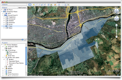
Yesterday I was thinking about how to make maps more accessible by adding reference features to the display. Today I realized that since Google Earth is such an excellent reference tool – replete with imagery, street maps, and the captivating advantage of seamless navigation – the problem of anchoring the data might be resolved by presenting it in that context. As a trial, I used the ArcToolbox Layer to KML conversion tool to save some maps in a compatible format.
I think this is a useful way to lead a discussion about a place. We can present our data, yet easily and actively explore other aspects of the environment. A playful approach is engaging, and can have serious benefits: it is important to ask questions like “is this the right data?” or “what else is going on here?”. I feel this exploratory attitude is appropriate in my situation; when I present our data, I want to inspire the group to think about possible applications and variations.
The sample map pictured above is faulty in that no legend is displayed. I think it is possible to include a legend, among other things, in the KML file. I look forward to getting up to speed on Google Earth & Maps technology. I expect that in the future more Binghamton Neighborhood Project data will be made available online in this way; Google even encourages projects like ours through Outreach.
Here I advocate using Google Earth as a venue for presenting conventional choropleth maps because of the ease with which other reference layers can be explored, providing context for the data. I agree with Mark Harrower that three dimensional thematic maps (porcupine globes) are generally unsuccessful, but the debate is interesting, so check out the relevant posts by Bjørn, Leszek, and Rich.
Rich concludes with some points that reflect my own reasons for enthusiasm about this approach. In particular, he gives this example:
Draping a thematic map over topography can be a useful visualisation e.g. polygons showing erosion rate draped over a range of mountains, by eye you could then relate erosion to slope.
The sample map shown above happens to be “Percent Tree Cover” by census block. With Google Earth’s Terrain layer enabled, it soon becomes evident that the hilltops are the most heavily forested areas around the city. I am curious what other neighborhood relationships the group will uncover when we explore our demographic data!
Posted on Thursday, June 18th, 2009. Tags: geography.
